The accumulation distribution indicator is, by far, one of the most insightful indicators for traders today. By analyzing price action moves and their volume, traders can predict price cycle phases and confirm trends. Some authors and technical analysis tools can even turn this volume-based indicator into a momentum indicator to capitalize on impending market reversals to make considerable profits!
The original accumulation distribution indicator by Marc Chaikin is a volume-based indicator that measures the cumulative flow of money in and out of a financial asset, allowing us to visualize how supply and demand affect the price action. Williams’ accumulation distribution indicator, on the other hand, is used as a trend and momentum indicator that trades on divergences. Today we’ll learn how to use these valuable tools in technical analysis and how they fit into the Wyckoff price cycle!
Accumulation Distribution Indicator
As we mentioned, the accumulation distribution indicator, specifically the Accumulation/Distribution line, helps us assess price trends and spot forthcoming reversals. It shows whether an asset is currently being accumulated or distributed, making it an essential part of any sensible technical analysis strategy that seeks to maximize profit opportunities and minimize losses.
The accumulation distribution indicator and its chart line have been adapted throughout the years to function as momentum and trend indicators. These illustrations allow us to spot divergences and time market entries and exits before market reversals occur. It’s also used as a pillar to Wyckoff’s Composite Man theory and the various price cycle phases, which aims to understand how smart money repeatedly and conclusively affects a financial asset’s price.
Accumulation Distribution
Before we learn how to use the different versions of the accumulation distribution indicator in our technical analysis strategies, it’s important to understand what accumulation and distribution mean. For simplicity’s sake, we’ll use Wyckoff principles and rules to understand the accumulation distribution phases since they help us visualize the relationship between volume and price action clearly.
As a trader, you’ll choose whether to reject or embrace this way of analyzing a trading chart and its underlying principles. Regardless, you’ll clearly understand how these concepts (accumulation and distribution) and price cycle phases coexist to create recognizable and repeatable patterns.
Professional traders use the Wyckoff method to read charts, specifically the price action and volume bars, to understand and predict how The Composite Man will affect future price movements. The Composite Man is an imaginary identity of the market that manipulates the stock market and a security’s prices in his best interest to ensure he can buy low and sell high at all times.
The Composite Man embodies modern institutions, which traders often refer to as “smart money,” and how it moves markets to profit at most traders’ expense. Whether you adhere to this market analysis’s central idea (or refer to Elliot Wave or the Dow Theory principles) is entirely up to you. Still, Wyckoff’s understanding of the relationship between price action and volume and its laws primarily interests us from an educational and practical standpoint.
Wyckoff’s first law of supply and demand tells us that prices rise when demand is greater than supply, and when supply is greater than demand, prices fall. We can study the balance between supply and demand by comparing price and volume bars in a chart to understand their relationship and gain insight into upcoming market movements.
The law of Cause and Effect states that the differences between supply and demand are not random; instead, they result from planned events that occur over time. We can see a period of accumulation as the cause and the resulting uptrend or downtrend as an effect.
The third law of Effort vs. Result says that price changes result from an effort, represented in a trading chart by the volume bars. The trend, therefore, will continue if it aptly represents the currently traded volume, but if the volume and price action diverge, the trend is likely to reverse. Now it’s time to define what accumulation and distribution mean and how to spot them in a chart.
Distribution vs Accumulation
The accumulation process is the first stage of the Wyckoff price cycle, defined as the accumulation of stocks by powerful financial entities. The Composite Man accumulates assets gradually (usually after a bearish move) to guarantee they’re buying low over an undefined period. These long positions are built with no significant upward price action because sellers aren’t aggressive enough to push the price below the support zone.
During accumulation, a clear channel with support and resistance levels can be seen on the chart, where buyers ultimately prevail to push the stock price to new heights. Alternatively, weaker traders might back off if the accumulation period drags on, allowing the Smart Money to deplete the overall supply. According to this definition, an accumulation process would look like this:
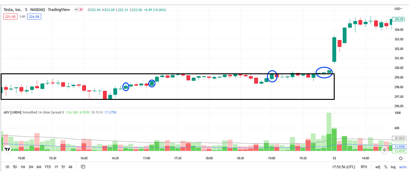
Notice that the chart’s price action is flat since it’s currently trading sideways. The range is also populated by traders that have held on through a previous short to medium downtrend, a section of the market that the Smart Money would love to drive away. The price action might dip below the support line to scare weak holders, prompting the Smart money to swoop in and exhaust the remaining supply. This process may occur several times over time, with notable volume spikes appearing every time the price action nears or breaks the support level.
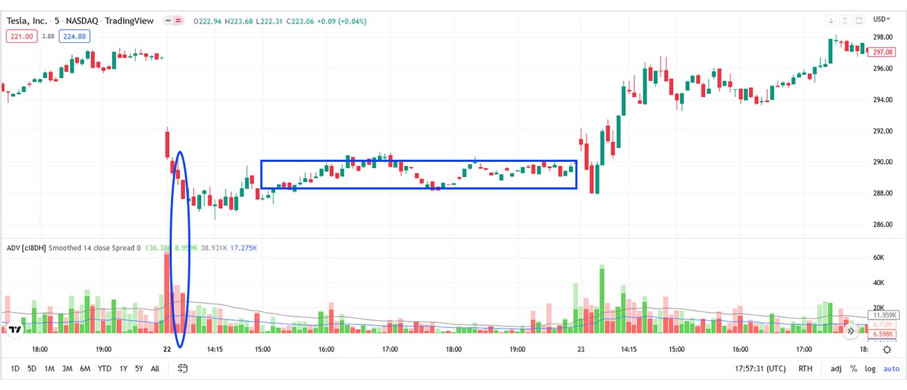
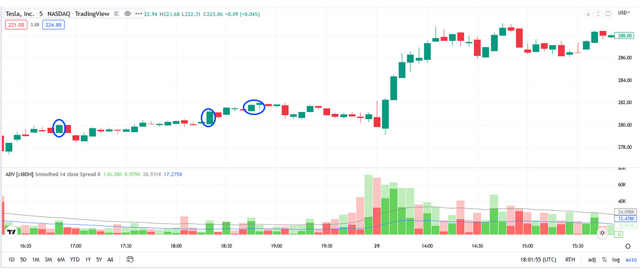
Once they’ve successfully exhausted the supply, you’ll likely notice higher lows gradually populating the current trading range in preparation for a bull run. When you can observe higher highs and higher lows in the range, you’ve got a powerful signal that the stock will break through soon.
Distribution vs Accumulation
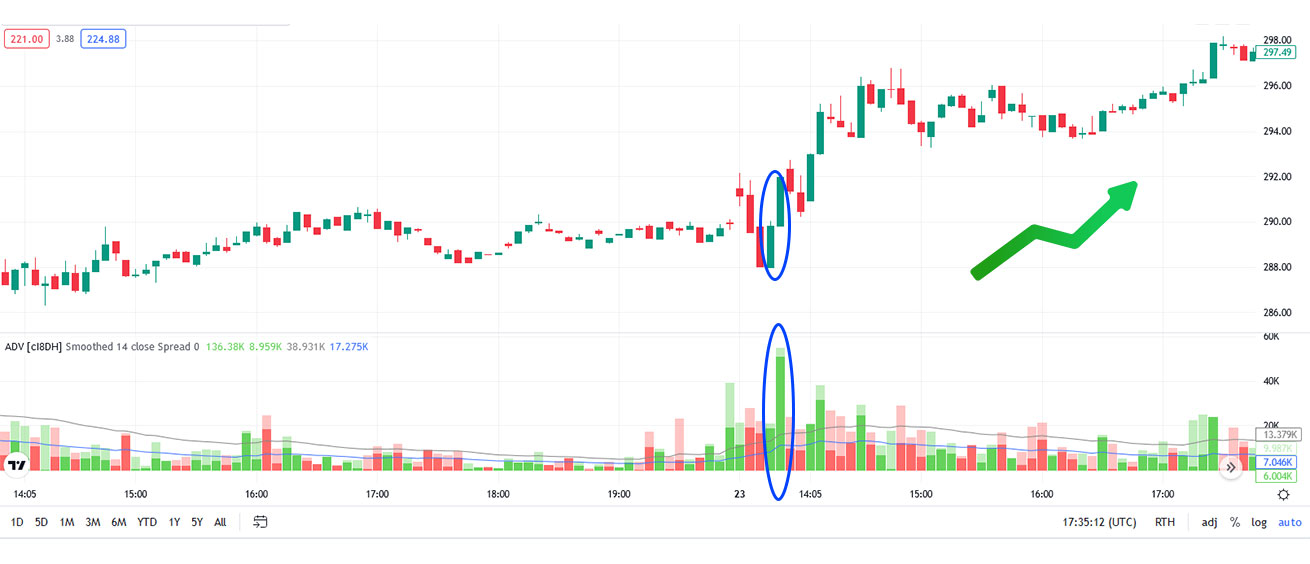
The next phase that helps us differentiate distribution vs accumulation is called the “Markup Phase.” The markup phase is the second stage of the Wyckoff trading cycle, where The Composite Man pushes the market up at will. With supply essentially depleted, demand ramps up, and more investors join with their long positions, fueling the uptrend.
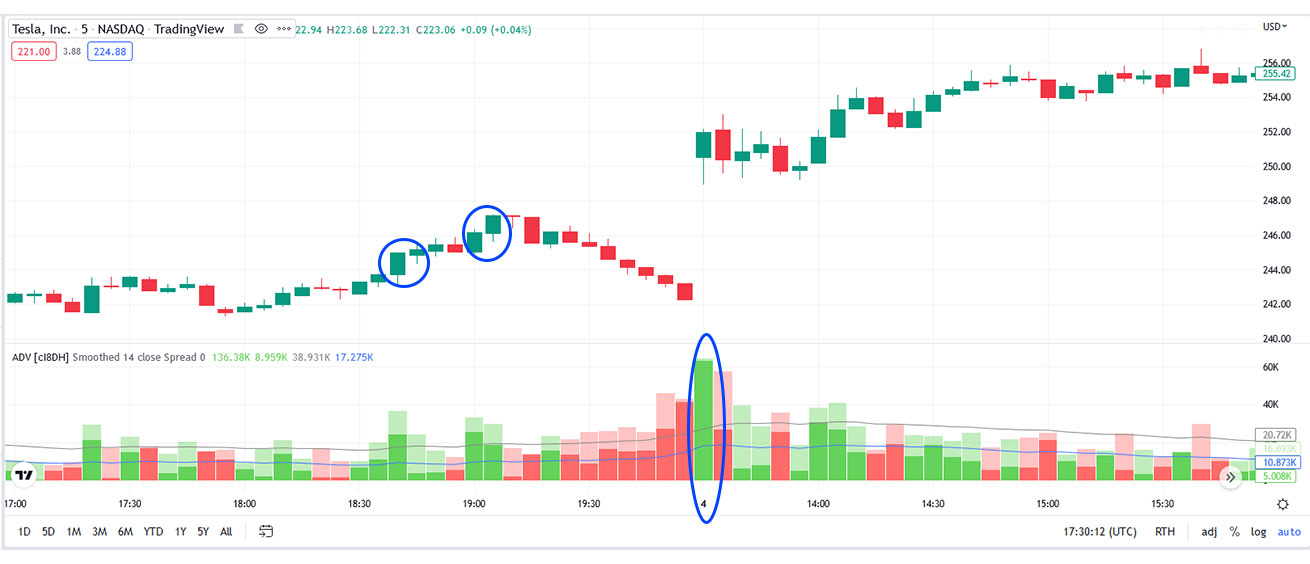
If the trend stops and trades sideways for a period, the markup phase is prolonged by a re-accumulation phase. Eventually, the market moves up since it attracts newer players, and supply is nearly exhausted. During this stage, the price action breaks resistance levels with wider spreads and higher volumes, but since the move has already been confirmed, many traders opt to join in just before the distribution phase truly begins Traders that understand the price cycle and time their entry well further catapult the price to that distribution phase. Many would argue it’s the ideal time to enter the trade since the volume backs the breakout and the markup is in full swing.
Accumulation vs Distribution
The third part of the Wyckoff cycle truly contrasts accumulation vs distribution and all its differences. The Composite Man has patiently accumulated his stocks for a while, and now it’s time to distribute his holdings for a profit. Many traders who believe they are still in time to join the market movement will take over these holdings without realizing that the price action is about to enter a new range.
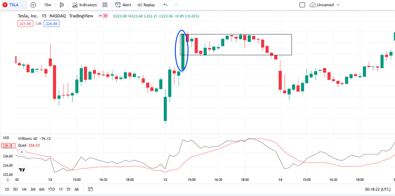
When discussing accumulation vs distribution, it’s odd how different these two parts of the cycles are when they share such a similar pattern on the charts. The stock, once again, trades sideways, but it’s now the composite man that ruthlessly stops the price action from breaking the resistance zone.
Once it’s clear that the market cannot create higher lows on this sideways movement, it’s safe to say that the market has entered the distribution stage. The Composite Man will match the demand created by run-off-the-mill traders who genuinely believe they’re on time to trade a stock with a notoriously bullish uptrend.
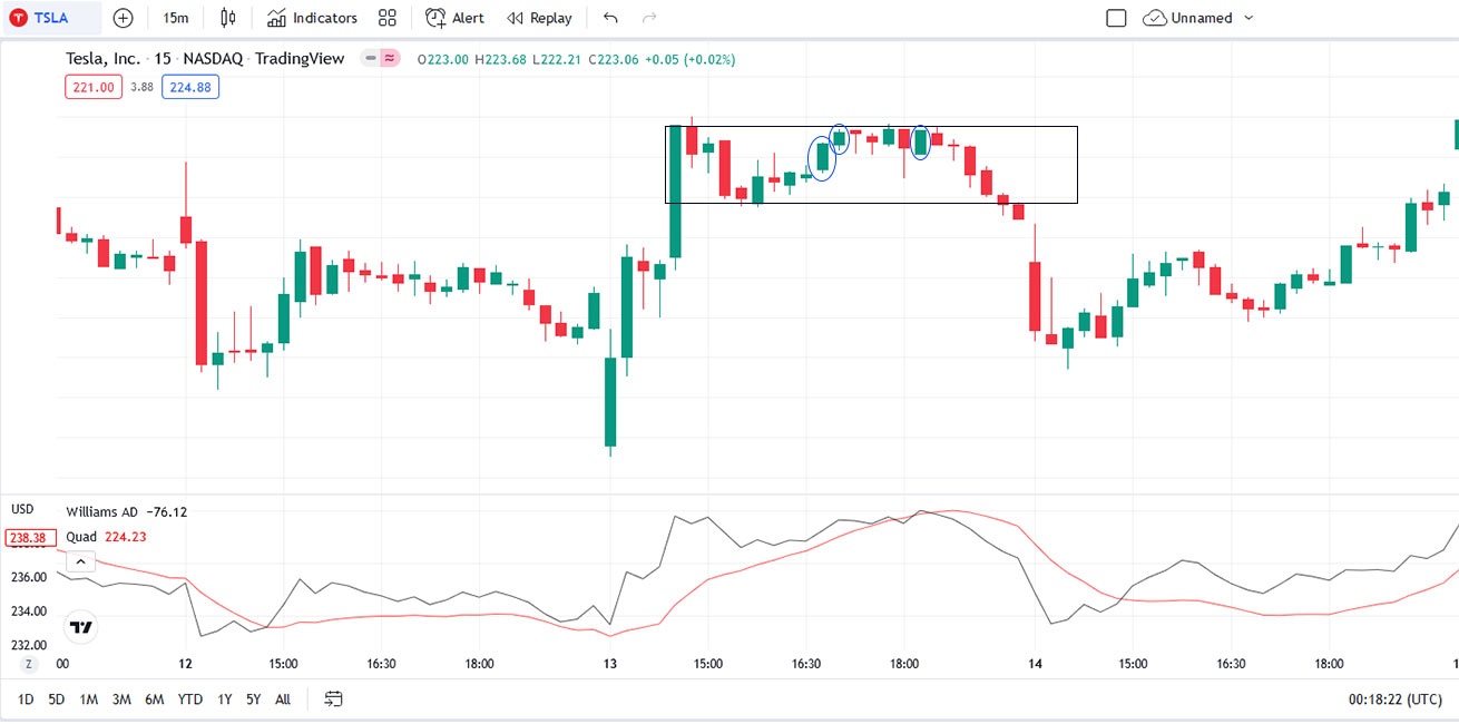
However, the smart money has already decided to offload their stock to these amateurs, carefully keeping it within this new range to lure the price action and prospective traders into the resistance zone. Once the stock is no longer supported by volume from these large financial institutions and their deep pockets, the price action will inevitably descend.
Distribution and Accumulation Final Stage
According to Wyckoff, the distribution and accumulation cycle ends with a markdown. We notice lower highs and lower lows as the price break the support level. With supply vastly outshining demand, the price action gradually descends, and a downtrend is established, with clever traders honing in on the trend and choosing a short position. The bearish phase eventually ends, and a new accumulation phase begins to restart the cycle.
With the cycle repeating, now it’s more important than ever to remember that when faced with a trading opportunity, we must look at what happens on the left of the chart before we attempt to predict the next market move. After all, if we run into a consolidation pattern, we must determine if we’re looking at an accumulation or a distribution phase since they both trade sideways between a range.
Are we looking at a stock that has rallied before a downtrend? Are we currently in a distribution phase? Or are we in a situation where we’ve come down from a high point and accumulated after a markdown? Answering these questions requires us to identify and interpret signals and patterns to further hone our trading strategies and price action predictions. Let’s start with listing these signals.
Accumulation Distribution Strategy
A fundamental part of any accumulation distribution strategy is carefully analyzing the volume behind every potential breakout. High volumes can lead to sustained price moves that signal a bullish markup or a bearish markdown. Price-altering moves with low volumes are known as springs when they’re preceding a markup stage and an upthrust when they’re creating a false uptrend in the distribution phase to bait more traders into absorbing the supply distributed by smart money.
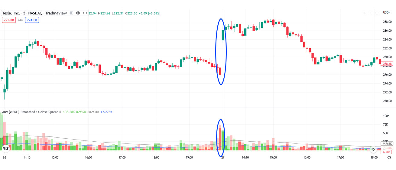
Here, we can observe a typical accumulation phase: we got a price action trading within an established range, followed by higher lows sprinkled through it. Then comes the real price reversal, followed by a massive volume increase, a strong signal of a price cycle shift into the markup stage. Occasionally, you’ll notice a false breakout beneath the support line (revealed by the low volume behind the move); should it be present, consider it another clue that a phase change is near.
As you can tell, understanding how the volume bars relate to pricing moves and how they both tie into a Wyckoff price cycle phase is essential. If you recognize an accumulation stage, you’ll know that the beginning of a markup stage could occur soon and that it’d be wise to consider a long position. On the contrary, if you can identify a distribution stage, you can time the beginning of a markdown stage with a short position.
A way to differentiate Accumulation from Distribution stages is to look at how the price ranges. If you can spot higher lows throughout, you’re more likely to be in an accumulation stage; on the other hand, if you spot lower highs throughout, you’re likely in a distribution stage.
Certain chart patterns can also help you identify transitions between price cycle stages. Flag patterns and Megaphone patterns spotted after a spring (false breakout) are additional clues that signal an ongoing markup phase.
Suppose you wish to use the accumulation distribution indicator as a trend indicator. In that case, you can also plot a 50-period Simple Moving Average and scan for high-volume price action breakouts that move below or above the 50 SMA line. You’ll still look for lower highs (or higher lows) throughout the ranges, but noticing these high-volume price moves and how they cross the SMA line will help you time your market entries well.
Accumulation Distribution Strategy for Trend Trading
Another great way to use the accumulation distribution indicator as a momentum indicator is to use Larry William’s version of the stock indicator. All you have to do is plot a 14-period zero lag exponential moving average and the Accumulation Distribution line in a subgraph and see how they interact. You won’t notice much of a pattern during the accumulation and distribution phases because the market is moving sideways.
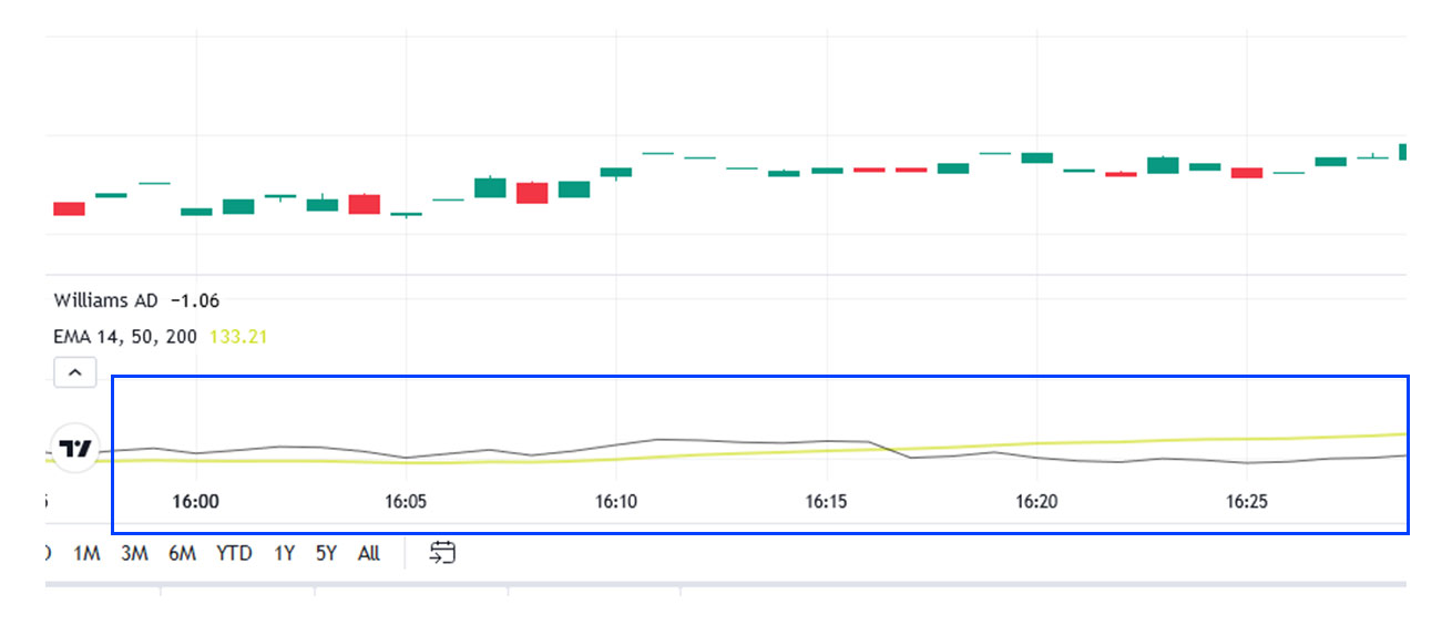
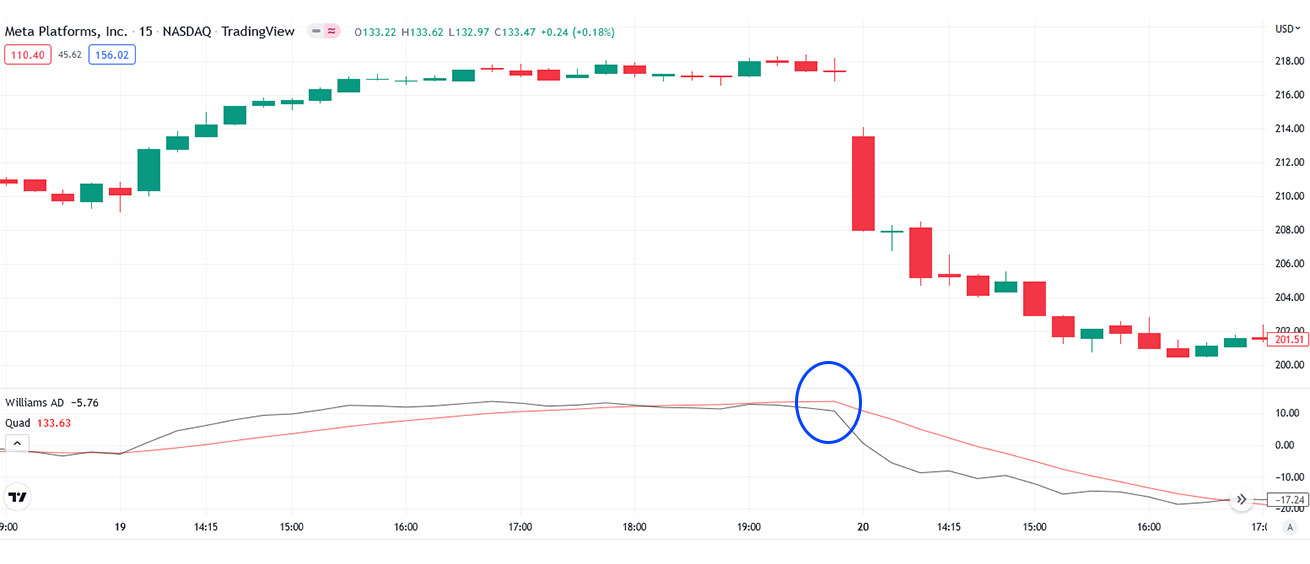
However, you’ll have an interesting market entry or exit signal once a gap opens up between the lines. If the market enters a downtrend or markdown phase, the A/D line pulls below the 14-period EMA, signaling us to go short.
Alternatively, if the A/D line moves above the 14-period EMA line, we’re given a signal to take a long position.
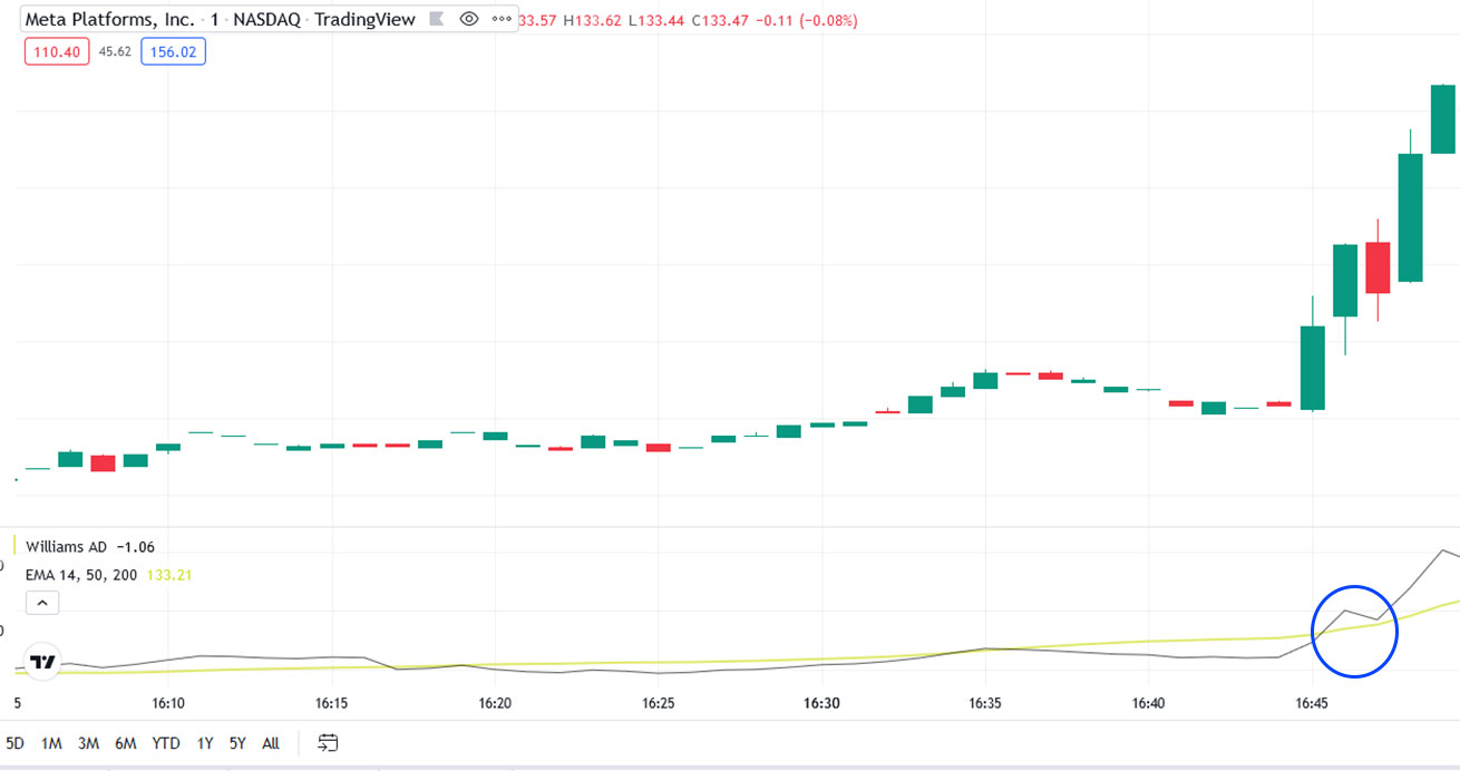
The indicator is pretty accurate, but it requires some supervision. It would be best if you always combined this strategy with other stock indicators to confirm that a price reversal is near. For instance, confirming price reversals with the MACD indicator is highly recommended.
Review
As with any other indicator, it’s important to remember that the Accumulation Distribution indicator (and the strategies we’ve covered) are unlikely to create profits alone. They’re meant to be used as clues in a grand chart analysis strategy that scans for price cycles, screens stocks, and incorporates other accurate stock indicators, such as the MACD and RSI, to confirm upcoming price reversals and market entries and exits.
Stock indicators in technical analysis are meant to be used as clues that fit into your chart analysis and price cycle philosophies. By looking at numerical-based, unbiased indicators and past stock price behavior, you’re more likely to make objective, profit-driven decisions to bolster your portfolio.


