Autocorrelation (ACF) is a calculated value used to represent how similar a value within a time series is to a previous value. The Statsmoldels library makes calculating autocorrelation in Python very streamlined. With a few lines of code, one can draw actionable insights about observed values in time series data.
The ACF can be used to identify trends in data and the influence of previously observed values on a current observation. The applications of the ACF are broad but most notably can be used for signal processing, weather forecasting, and securities analysis. Sometimes, you can even discover hidden trends that are anything but intuitive!
TL;DR – Finding the autocorrelation in Python for Time Series data is easy when using the statsmodels plot_acf function as such:
import pandas as pd
from matplotlib import pyplot as plt
from statsmodels.graphics.tsaplots import plot_acf

# Have some time series data (via pandas)
data = pd.read_csv('time-series.csv')

# Select relevant data, index by Date
>>> data = data[['Date', 'Observations']].set_index(['Date'])

# Calculate the ACF (via statsmodel)
>>> plot_acf(data)

# Show the data as a plot (via matplotlib)
plt.show()
Introduction
Autocorrelation, also called serial correlation, is used by stock traders, meteorologists, chemists, and more to forecast future values given historic Time Series data. That’s a crucial aspect of calculating both autocorrelation and partial autocorrelations—previous data. This type of regressive analysis is used to help predict future prices within a confidence interval (typically 95%) and relates a current value to previous ones.
Autocorrelation estimates the influence of all past observed values on the currently observed value. This differs from partial autocorrelation in which only a single past observed value is measured for influence on the currently observed value.
Calculating Autocorrelation in Python
Learning how to find the autocorrelation in Python is simple enough, but with some extra consideration, we’ll see how and where this function can be applied and where and when it might fall short. First, let’s go over some quick definitions:
- Lag – the number of previous observations measured during autocorrelation.
- Positive Correlation – A relationship where one value’s increase predicts an increase in another.
- Negative Correlation – A relationship where one value’s increase predicts a decrease in another.
- Confidence Interval – A calculated range of values in which would likely contain an unknown value for sampled data.
- Confidence Level – Probability a confidence interval will contain an observed value.
Understanding these terms is not essential to creating an autocorrelation plot in Python but will greatly improve our ability to interpret that plot! In this article, we’ll use the statsmodel library’s plot_acf function to analyze time-series data and plot the autocorrelation function. We’ll be using Pandas, Statsmodel, matplotlib, and—of course—Python!
Note: For a deeper, more mathematical-oriented, discussion of how to calculate autocorrelation values I suggest reading this article. Our discussion here will not touch on the finer points of calculating the ACF function and more on the visual representation and interpretation.
Step 1: Get Time Series Data
The first step is obvious—we need to get some data. Generating random time series data can be a useful tool for exploring analysis tools like statsmodels and matplotlib. Randomly generated data won’t reflect trends that will show up in autoregressive analysis, however. Given this knowledge, we’ll be using historic stock data for $TSLA for this article. Let’s take a look at our data:
import pandas as pd

# Read in CSV data to Dataframe
df = pd.read_csv('TSLA.csv')

# Drop all columns but 'Date' and 'Adj Close', reindex using 'Date'
df = df[['Date', 'Adj Close']].set_index(['Date'])

# View data
>>> df

             Adj Close
Date
2020-01-02   86.052002
2020-01-03   88.601997
2020-01-06   90.307999
2020-01-07   93.811996
2020-01-08   98.428001
...                ...
2021-06-23  656.570007
2021-06-24  679.820007
2021-06-25  671.869995
2021-06-28  688.719971
2021-06-29  680.760010

[376 rows x 1 columns]
Note: The historic pricing data comes from finance.yahoo.com but can also be downloaded from Github here.
As we can see, we now have 376 recorded prices from 2020-01-01 through 2021-06-30 reflecting a percentage increase of 691.103%. Not too shabby—if only we’d been doing some autocorrelation at the beginning of 2020 we might have been surfing that wave!
Step 2: Inspect & Clean Data
Before performing an autocorrelation on our time series we need to inspect the data for missing values. Fortunately, Pandas offers several convenient tools for finding and replacing missing values in time series data. We’ll not go into all the options and considerations for such an operation in this article. Instead, let’s just do a quick check to see if there are any missing values:
# Check if any null or NaN values in data
>>> df.isnull().sum()

# Result
Adj Close    0
dtype: int64
In using Pandas’ isnull().sum() method we are told that our single non-index column Adj Close contains zero null or NaN values. This means we can go onto the next step and start visualizing our data.
Note: Check out this article for an in-depth discussion on other ways to find and replace missing data using Pandas.
Step 3: Visualize Data
Before calculating an autocorrelation it will be useful to understand what our data looks like visually. This can help spot possible trends, inform us if the data likely has no linear correlation, or make evident any number of other issues that might affect how we choose to move forward.
In some cases, visualizing the data might help us realize we need to take a step back and reassess our inspection practices and better clean the data! For this step, we’ll use a simple line plot via matplotlib:
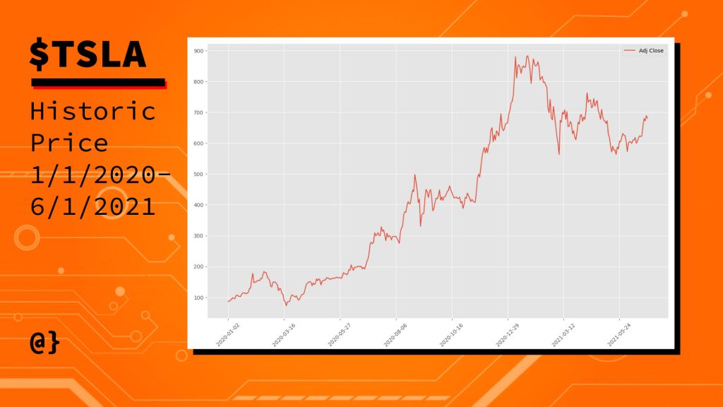
This lets us know that our data reflects a consistent upward trend that we’d guessed at after calculating the percentage increase of our values earlier. Given that there are no massive drop-offs in the plotted values I’d say our check for missing data was successful. Now we can move on to autocorrelation!
Step 4: Perform Autocorrelation & Visualization
Now that we have confidence in our data we can proceed to generate an autocorrelation visualization using statsmodel, pandas, matplotlib, and Python. These modules have been abstracted to a great degree and this entire process can be done in only a few lines of code:
from statsmodels.graphics.tsaplots import plot_acf
import matplotlib.pyplot as plt


# Use the Autocorrelation function
# from the statsmodel library passing
# our DataFrame object in as the data
# Note: Limiting Lags to 50
plot_acf(data=data, lags=50)

# Show the AR as a plot
plt.show()
We see that two imports are needed—pyplot and the statsmodels‘ plot_acf function to create the visualization. Fortunately, these two libraries work well together and the pyplot chart is implicitly referenced. This results in the following plot:
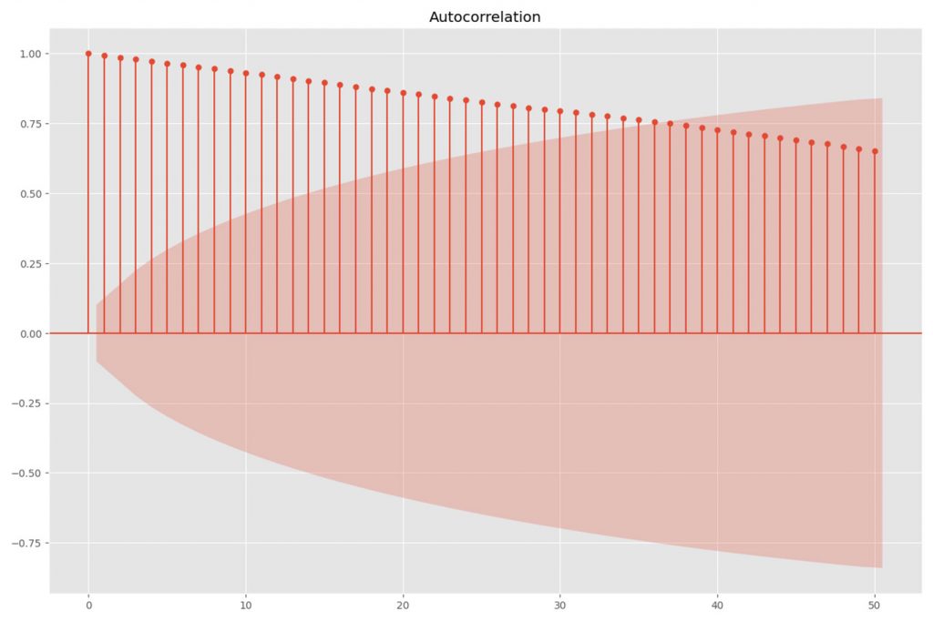
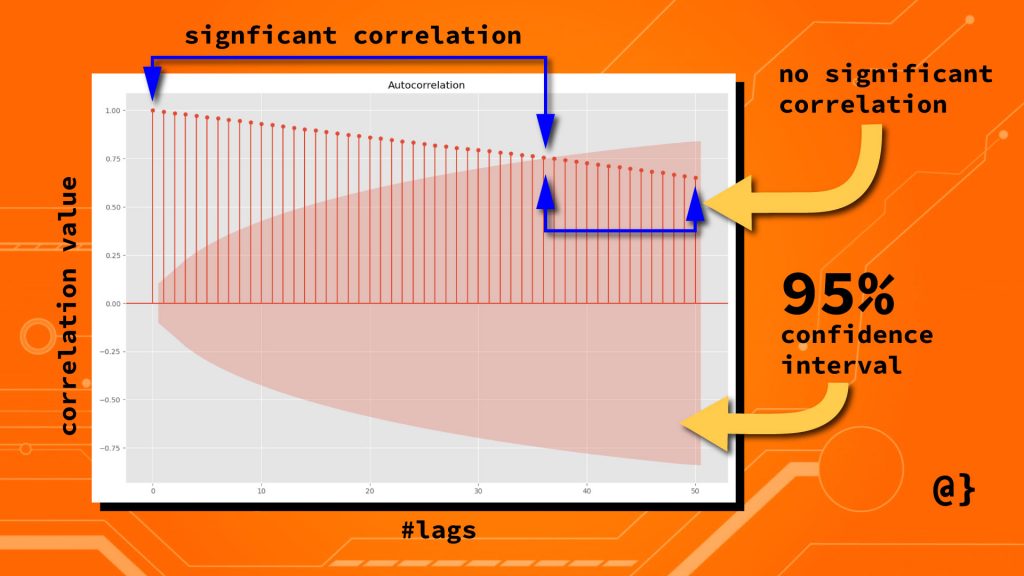
This looks pretty interesting but ultimately doesn’t offer much utility without knowing how to read it! The red shaded region is the confidence interval with a default value of α = 0.05. Anything within this range represents a value that has no significant correlation with the most recent value for the price.
The vertical lines with markers at their tops are the “lags” that represent a specific number (50, in this case) of previous values. These represent the correlation value (shown on the y-axis) and diminish at a steady rate as their proximity from the current price increases. That’s not the case with all data but certainly so with ours.
Step 4: Interpreting the Autocorrelation
This lets us know that previous prices influence the current price but the significance of that influence decreases steadily with time. Specifically, values beyond the 36th previous trading day have no significant predictive power on the current price.
The strength of this relationship is measured on a scale of -1 to 1 when -1 being a 100% negative correlation and with a value of 1 being a 100% positive correlation. This measure is shown on the y-axis. Consider the following diagram for a more visual interpretation:
Applications
We’ve seen how easily autocorrelation data can be visualized using the library. We’ve seen how to interpret these visual representations to [hopefully] gain insights into deeper patterns reflected in certain observable data. Our historic pricing data for $TSLA wasn’t very exciting—though illustrated that previous closing prices are related to current closing prices. Let’s consider some more exciting and revealing data.
Tidal Data
Weather data is a common application for autocorrelation analysis. Seasonal, regional, and even daily influences can be dramatically revealed by visual representations of autocorrelation analysis. Here’s a look at tidal data measured every six minutes:
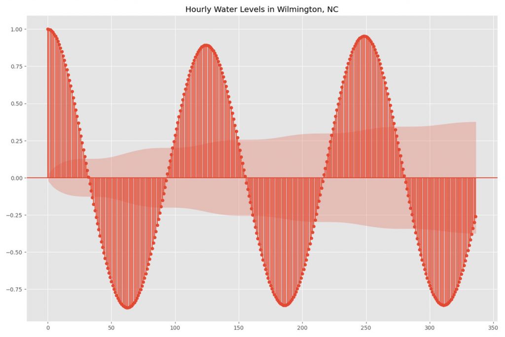
Each data point represents a measure of the water level recorded at 6-minute intervals (240 per day.) Here we see a strong trend of positive and negative correlation emerge. This is representative of what we’d expect given what decades of tidal study have observed.
Air Pollution
Air pollution is another common application for autocorrelation. While tidal data represent a very known periodicity, these data often reflect seasonal patterns with less data to predict frequency or strength of correlation. The chart below describes the max 8-hour observed CO2 levels for Los Angeles County, California from 2017-2020.
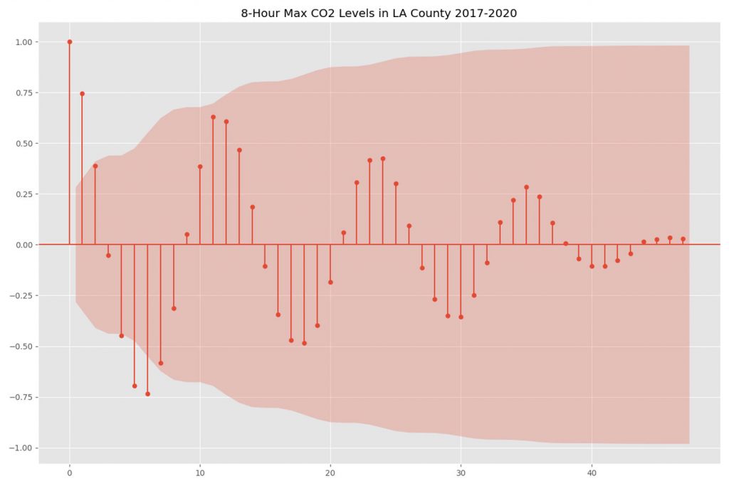
We see here that, while not of statistical significance, there is a strong observable pattern in which past values can be used to forecast future values. These data have been resampled to reflect monthly averages. In this case, lag values of 6-7 months reflect a strong negative correlation, and lag values of 6-7 months reflect a strong positive correlation.
Limitations
Autocorrelation is a useful tool in detecting patterns of periodicity, seasonality, or other less intuitive sources of influence. No forecasting technique is perfect and autocorrelation is no exception. Some well-known areas in which autocorrelation may fall short are listed below:
Too Much Retained Information
In signal processing, data often represents may subtle changes or artifacts generated during observation. Applications like speech-pattern recognition, radio-frequency analysis, and x-ray analysis all generate massive amounts of noise. These data points can skew correlation metrics such that an autocorrelation model might find false influence or fail to capture positive influence (Fukushima, 1985; Willink, 2013)
Final Thoughts
Autocorrelation is a useful tool in identifying statistically significant relationships among observed values in linear data. We’ve seen how the ACF is useful in identifying seasonal or natural trends, how it can be applied to the technical analysis of stock price data, and even noted some of its shortcomings.
We’ve also seen how the ACF can be quickly and effectively calculated and visualized in Python. Having this type of statistical tool handy can help one better analyze and interpret data in ways that help make better-informed decisions. For example, hosting your outdoor festival in Los Angeles when your data indicates the air pollution levels would be lower!
References
- Willink, Tricia J. “Limits on Estimating Autocorrelation Matrices from Mobile MIMO Measurements.” International Journal of Antennas and Propagation, vol. 2013, 2013, pp. 1–6.
- Fukushima, Teiichiro, et al. “Limitations of Autocorrelation in Fetal Heart Rate Monitoring.” American Journal of Obstetrics and Gynecology, vol. 153, no. 6, 1985, pp. 685–92.


