The Moving Average Convergence Divergence (MACD) is one of the most popular technical indicators used to generate signals among stock traders. This indicator serves as a momentum indicator that can help signal shifts in market momentum and help signal potential breakouts. Integrating this signal into your algorithmic trading strategy is easy with Python, Pandas, and some helpful visualization tools.
Moving averages are excellent indicators of overall market trends. They can help signal intraday trends, resistance or support levels, or even signal the end of a bull market. The MACD takes moving averages a step farther and provides insight into the buying and selling pressure in a market. That’s to say; the MACD can help signal when a market has become overbought (time to sell) or oversold (time to buy).
MACD 101: Understanding the Indicator
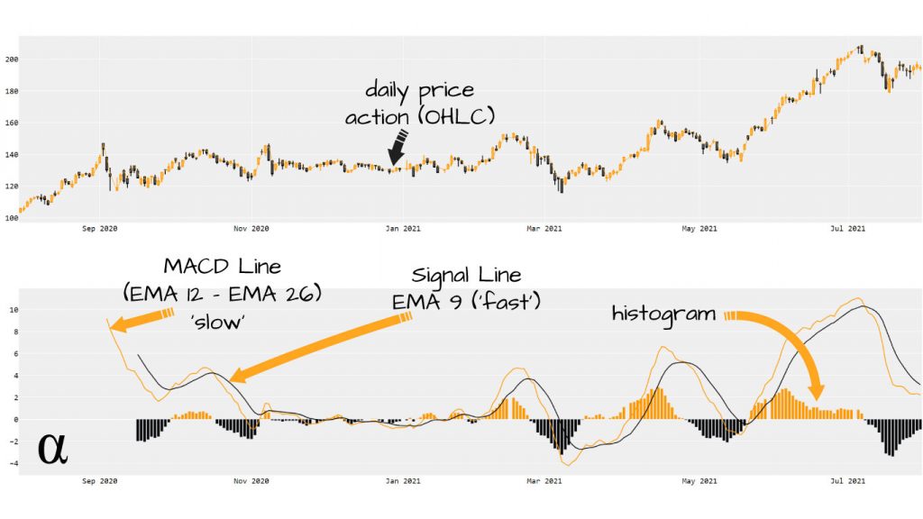
Before we get into calculating and applying the MACD using Python we’ll briefly cover what this indicator describes and how to interpret it. First, we need to know a little bit about moving averages also. Moving averages are lagging indicators that use a specific number of previous values to calculate a current value.
Moving Averages
In stock trading, a common moving average is the Simple Moving Average (SMA). This takes the last n-many closing prices (n being the number of previous days specified) and calculates the average price of all those.
For example, if a particular security’s five previous closing prices were {10, 15, 20, 25, 18} the SMA for the current day would be 10+15+20+25+18 = $17.6. Adjusting the number of previous days can be useful in adjusting a moving average for different purposes.
Convergence & Divergence
The MACD represents 3 district values, each of which are interconnected. The insights provided by the MACD require one to understand how each of these values is calculated, what they represent, and the implications of movement relative to one another. Below are the MACD’s main primary signals.
MACD – the value of an exponential moving average (EMA) subtracted from another EMA with a shorter lookback period. Common values are 26 days for the longer EMA and 12 for the shorter. This is referred to as the ‘slow’ signal line of the MACD.
Signal– the EMA of the MACD of a period shorter than the shortest period used in calculating the MACD. Typically, a 9-day period is used. This is referred to as the ‘fast’ signal line.
Difference – The difference between the MACD – Trigger line is used to represent current selling pressures in the marketplace. This value is commonly charted as a histogram overlaying the MACD + Trigger signals. A positive value for this signal represents a bullish trend whereas a negative value indicates a bearish one.
Check out our detailed article Moving Average Convergence Divergence (MACD) for a more technical and in-depth discussion on how this indicator is calculated and interpreted.
Calculating the MACD in Python
With a refreshed understanding of MACD, we can now consider how to calculate it within a Python environment. The MACD can be manually calculated in Python using nothing but built-in functions and custom function definitions as with all technical indicators. For our discussion here, we’ll be looking at two more abstracted approaches:
- Calculating the MACD using built-in functions native to Pandas DataFrame objects;
- Using the
pandas_talibrary to more conveniently calculate the MACD across aDataFrame.
Before we can calculate the MACD, visualize the MACD, or even apply the MACD to our trading strategy we’ll need to take one paramount action—get some data! For this, we’ll use the yfinance library to conveniently pull in some historic pricing data for $BTC-USD as follows:
import yfinance as yf

# Request historic pricing data via finance.yahoo.com API
df = yf.Ticker('BTC-USD').history(period='1y')[['Close', 'Open', 'High', 'Volume']]

# View our data
print(df)

                   Close          Open          High       Volume
Date
2020-08-02  11053.614258  11758.764648  12034.144531  27410067336
2020-08-03  11246.348633  11043.768555  11453.079102  20271713443
2020-08-04  11205.892578  11246.203125  11385.381836  21250197042
2020-08-05  11747.022461  11203.823242  11786.617188  24411254471
2020-08-06  11779.773438  11749.871094  11902.335938  23400740340
...                  ...           ...           ...          ...
2021-07-29  40008.421875  39995.453125  40593.070312  27167146027
2021-07-30  42235.546875  40027.484375  42235.546875  33072782960
2021-07-31  41626.195312  42196.304688  42231.449219  25802845343
2021-08-01  39974.894531  41460.843750  42541.679688  26688438115
2021-08-02  39716.246094  39943.519531  40414.351562  27748661248

[363 rows x 4 columns]
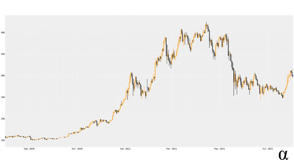
This results in 363 rows of data across which our MACD will be applied. This will give us a fairly large view of how the MACD operates and how it may have—or may not have—helped explain some of the price action as $BTC-USD moved from $11,053 to $39,716 in a year (a 259% increase!) Here’s a Candlestick chart (created in Plotly) representing our data:
Method 1: Calculating the MACD with Pandas
Pandas provides a built-in function to its DataFrame class named ewm() which stands for exponentially-weighted mean. This will allow us to calculate the MACD and the Trigger values that will, in turn, provide us with the raw values needed to represent the convergence/divergence. Consider the following code:
import yfinance as yf

# Request historic pricing data via finance.yahoo.com API
df = yf.Ticker('BTC-USD').history(period='1y')[['Close', 'Open', 'High', 'Volume', 'Low']]

# # Calculate MACD values using the pandas_ta library
# df.ta.macd(close='close', fast=12, slow=26, signal=9, append=True)

# Get the 26-day EMA of the closing price
k = df['Close'].ewm(span=12, adjust=False, min_periods=12).mean()

# Get the 12-day EMA of the closing price
d = df['Close'].ewm(span=26, adjust=False, min_periods=26).mean()

# Subtract the 26-day EMA from the 12-Day EMA to get the MACD
macd = k - d

# Get the 9-Day EMA of the MACD for the Trigger line
macd_s = macd.ewm(span=9, adjust=False, min_periods=9).mean()

# Calculate the difference between the MACD - Trigger for the Convergence/Divergence value
macd_h = macd - macd_s

# Add all of our new values for the MACD to the dataframe
df['macd'] = df.index.map(macd)
df['macd_h'] = df.index.map(macd_h)
df['macd_s'] = df.index.map(macd_s)

# View our data
pd.set_option("display.max_columns", None)
print(df)

                   Close          Open          High       Volume  \
Date
2020-08-02  11053.614258  11758.764648  12034.144531  27410067336
2020-08-03  11246.348633  11043.768555  11453.079102  20271713443
2020-08-04  11205.892578  11246.203125  11385.381836  21250197042
2020-08-05  11747.022461  11203.823242  11786.617188  24411254471
2020-08-06  11779.773438  11749.871094  11902.335938  23400740340
...                  ...           ...           ...          ...
2021-07-29  40008.421875  39995.453125  40593.070312  27167146027
2021-07-30  42235.546875  40027.484375  42235.546875  33072782960
2021-07-31  41626.195312  42196.304688  42231.449219  25802845343
2021-08-01  39974.894531  41460.843750  42541.679688  26688438115
2021-08-02  39199.132812  39943.519531  40414.351562  27577835520

                     Low         macd       macd_h       macd_s
Date
2020-08-02  11018.129883          NaN          NaN          NaN
2020-08-03  11012.415039          NaN          NaN          NaN
2020-08-04  11094.145508          NaN          NaN          NaN
2020-08-05  11158.285156          NaN          NaN          NaN
2020-08-06  11598.713867          NaN          NaN          NaN
...                  ...          ...          ...          ...
2021-07-29  39352.058594  1198.565947  1071.163927   127.402019
2021-07-30  38397.355469  1599.001238  1177.279375   421.721863
2021-07-31  41110.832031  1845.901114  1139.343401   706.557713
2021-08-01  39540.941406  1886.577580   944.015893   942.561686
2021-08-02  38783.878906  1835.063020   714.001067  1121.061953

[363 rows x 8 columns]
Here we see our MACD values added to the DataFrame object as columns. These values can be used to inform algorithmic signals or serve as the basis for visualization. Note the first values for our MACD calculations are NaN values.
These result from our use of the min_periods argument when applying the Pandas ewn function. This instructs Pandas to not calculate values until there are as many as our window available (avoids using 0 values in calculations.) Without this specification, we would generate a LOT of false signals early on.
We could 100% start charting this data out for a visualization right now. However, we’re going to look at one more approach for calculating the MACD in Python. This approach, using the pandas_ta library, is much more succinct.
Method 2: Calculating the MACD with pandas_ta
Python’s rise to fame as one of the most popular programming languages can be largely attributed to its vast ecosystem of third-party libraries. Pandas, as we’ve already seen, offers a powerful framework for manipulating tabulated data.
The pandas_ta library is built on top of the Pandas library and integrates an immense number of technical indicator functions. These functions integrate natively with the DataFrame class and are applying via standard dot-notation access. Let’s see how using the pandas_ta library can calculate our MACD values in many fewer lines of code:
import pandas_ta as ta

# Request historic pricing data via finance.yahoo.com API
df = yf.Ticker('BTC-USD').history(period='1y')[['Close', 'Open', 'High', 'Volume', 'Low']]

# Calculate MACD values using the pandas_ta library
df.ta.macd(close='close', fast=12, slow=26, signal=9, append=True)

# View result
pd.set_option("display.max_columns", None)  # show all columns
print(df)

                   close          open          high       volume  \
date
2020-08-02  11053.614258  11758.764648  12034.144531  27410067336
2020-08-03  11246.348633  11043.768555  11453.079102  20271713443
2020-08-04  11205.892578  11246.203125  11385.381836  21250197042
2020-08-05  11747.022461  11203.823242  11786.617188  24411254471
2020-08-06  11779.773438  11749.871094  11902.335938  23400740340
...                  ...           ...           ...          ...
2021-07-29  40008.421875  39995.453125  40593.070312  27167146027
2021-07-30  42235.546875  40027.484375  42235.546875  33072782960
2021-07-31  41626.195312  42196.304688  42231.449219  25802845343
2021-08-01  39974.894531  41460.843750  42541.679688  26688438115
2021-08-02  39178.742188  39943.519531  40414.351562  27401984000

                     low  MACD_12_26_9  MACDh_12_26_9  MACDs_12_26_9
date
2020-08-02  11018.129883           NaN            NaN            NaN
2020-08-03  11012.415039           NaN            NaN            NaN
2020-08-04  11094.145508           NaN            NaN            NaN
2020-08-05  11158.285156           NaN            NaN            NaN
2020-08-06  11598.713867           NaN            NaN            NaN
...                  ...           ...            ...            ...
2021-07-29  39352.058594   1198.565947    1071.163927     127.402019
2021-07-30  38397.355469   1599.001238    1177.279375     421.721863
2021-07-31  41110.832031   1845.901114    1139.343401     706.557713
2021-08-01  39540.941406   1886.577580     944.015893     942.561686
2021-08-02  39165.199219   1833.436418     712.699785    1120.736633

[363 rows x 8 columns]
Here we see our MACD values (labeled a bit differently) having been calculated in a single line of code. This illustrates both the power and convenience of the pandas_ta library! Note that the values in the last few rows of our data differ slightly from our Pandas-native calculations. This results from how Pandas applies calculations and is beyond the scope of this article. See this informative thread on Stackoverflow for more insight. For now, let’s take our data and start visualizing!
Visualizing the MACD in Python with Plotly
The MACD values we have so far are 100% enough to inform an algorithmic trading strategy. However, being able to visualize technical indicators when developing trading algorithms is indispensable. In the following section we’ll cover how to use the Plotly visualization library to accomplish the following feats:
- Chart the price as a Candlestick visualization similar to the chart seen above;
- Chart the MACD and Signal lines in a second chart, below the Candlestick;
- Chart the Convergence/Divergence series as a Histogram overlaying our signal lines.
Plotly makes all of these tasks straightforward, though there are some tweaks we’ll make that aren’t explicitly outlined in the documentation. Don’t worry—it’s nothing too complicated. Consider the following code:
# get ticker data
df = yf.Ticker('BTC-USD').history(period='1y')[map(str.title, ['open', 'close', 'low', 'high', 'volume'])]

# calculate MACD values
df.ta.macd(close='close', fast=12, slow=26, append=True)

# Force lowercase (optional)
df.columns = [x.lower() for x in df.columns]

# Construct a 2 x 1 Plotly figure
fig = make_subplots(rows=2, cols=1)

# price Line
fig.append_trace(
    go.Scatter(
        x=df.index,
        y=df['open'],
        line=dict(color='#ff9900', width=1),
        name='open',
        # showlegend=False,
        legendgroup='1',

    ), row=1, col=1
)

# Candlestick chart for pricing
fig.append_trace(
    go.Candlestick(
        x=df.index,
        open=df['open'],
        high=df['high'],
        low=df['low'],
        close=df['close'],
        increasing_line_color='#ff9900',
        decreasing_line_color='black',
        showlegend=False

    ), row=1, col=1
)

# Fast Signal (%k)
fig.append_trace(
    go.Scatter(
        x=df.index,
        y=df['macd_12_26_9'],
        line=dict(color='#ff9900', width=2),
        name='macd',
        # showlegend=False,
        legendgroup='2',

    ), row=2, col=1
)

# Slow signal (%d)
fig.append_trace(
    go.Scatter(
        x=df.index,
        y=df['macds_12_26_9'],
        line=dict(color='#000000', width=2),
        # showlegend=False,
        legendgroup='2',
        name='signal'
    ), row=2, col=1
)

# Colorize the histogram values
colors = np.where(df['macdh_12_26_9'] < 0, '#000', '#ff9900')

# Plot the histogram
fig.append_trace(
    go.Bar(
        x=df.index,
        y=df['macdh_12_26_9'],
        name='histogram',
        marker_color=colors,

    ), row=2, col=1
)

# Make it pretty
layout = go.Layout(
    plot_bgcolor='#efefef',
    # Font Families
    font_family='Monospace',
    font_color='#000000',
    font_size=20,
    xaxis=dict(
        rangeslider=dict(
            visible=False
        )
    )
)

# Update options and show plot
fig.update_layout(layout)
fig.show()
This may look like a lot of code but the excess is mostly boilerplate. When using the Plotly fig.show() function our figure will be launched as a chart in the system default HTML viewer (probably Chrome.) This provides an interactive display where each period’s values can be inspected via mouse-over functions, scale can be adjusted, and several other useful actions including exporting as a .jpg or .png.
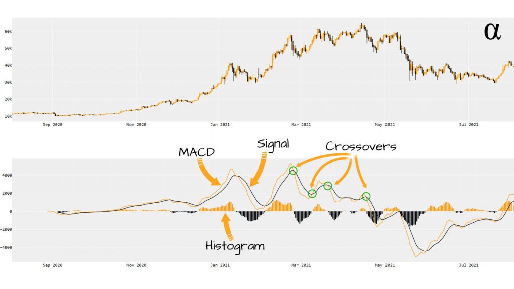
In the above illustration, we can see our price charted in the top figure and our relevant MACD data plotted on the bottom figure. I find having the price data visualized along with the MACD helps provide a more complete means of assessing the market.
On the bottom figure, we can see our MACD line in yellow, our Signal line in black, and several notable crossover points circled in green. The histogram, displayed a bar chart under the MACD and Signal lines, reflects yellow when the difference between the MACD and Signal is positive (uptrend) and black when the value is negative (downtrend.)
Common Gotchas
When visualizing MACD data there are some common issues that may arise. Firstly, there may be gaps in the data on non-trading days—depending on where the data is sourced from and how the DataFrame is indexed. There are [at least] two approaches for dealing with this, each with pros and cons:
Interpolating missing values to create a smooth transition. Note that the unit of frequency needs to be provided to Pandas for this calculation. If you’re using weekly data, hourly, or something other than Daily the 'D' needs to be replaced:
df.asfreq('D').interpolate()
Removing non-trading days by setting bounds on the Plotly visualization. This can also set time-period bounds as well to remove after-hours trading on trading data with a resolution lower than single-day bars:
fig.update_xaxes(
    rangebreaks=[
        dict(bounds=['sat', 'mon'])
    ]
)
Each of these approaches has its pros and cons but I tend to find the second to win out. The inclusion of estimated values in the data might work find for broad trend analysis but could cause some false signals here.
Review
The MACD’s popularity among technical traders can be attributed to its ease of interpretation and long-standing success rates. As with any technical indicator, the MACD is best used alongside other indicators to maximize the probability of generating a valid trade signal.
Combining the MACD with other signals such as the Simple Moving Average (SMA) to help identify resistance and support levels is one popular combo. Another long-standing approach is to use the MACD and the Relative Strength Index (RSI) in tandem to reinforce the signals generated by either.
Whichever indicator combinations your strategy may entail one thing is clear—if the MACD is involved it can easily be integrated via Python. The approaches shown here to visualize the MACD using Plotly are fairly basic but still provide valuable visualizations to help inform trading decisions.
For those seeking more complex applications, check out the article on Predicting Stock Prices with Linear Regression in Python. The MACD could easily be integrated into such modeling—or even more complex machine learning models.


