Correlation analysis is a powerful statistical tool used for the analysis of many different data across many different fields of study. Correlation matrices can help identify relationships among a great number of variables in a way that can be interpreted easily—either numerically or visually. Creating heatmaps from correlation matrices in Python is one such example.
Correlation is a relationship of dependency between variables where a change in the observed value of one variable is reflected by a unit change in another. Correlations are used to develop statistical models in machine learning as well as more traditional methods such as multiple and simple linear regression.
Highlights
- Understanding correlation, correlation coefficients, and basic concepts of regression modeling
- Quick crash-course on how the correlation coefficient is calculated and what it represents among variables
- Generating correlation matrices of different stock prices in Python
- Using correlation matrices to create visual heatmaps in Python using seaborn and other tools
- Understanding how to interpret correlation matrices, heatmaps, and what conclusions can be drawn from their insights.
- Common analytical applications of correlation analysis using matrices and heatmaps.
Correlation
Correlation is a numerical description of the linear relationship between two variables. It describes the amount of change in one variable in response to a unit change in another variable. For example; the price of a stock has a positive correlation with positive earnings reports. When an earnings report is positive the stock price is likely to move positively in response.
Covariance is another measure similar to correlation but only measures the direction (positive or negative) of the relationship between two variables where correlation measures both the direction and magnitude. Both measures provide useful insight in data analysis and are integral aspects of linear analysis.
Correlation Coefficients & Regression Models
Correlation analyses are applied in many areas of statistics but have a particularly integral role in regression analysis. In linear regression, correlation is represented in the linear model as correlation coefficients for predictor (independent) variables where they convey the estimated linear correlation with the response (dependent) variable. Consider the following equation:
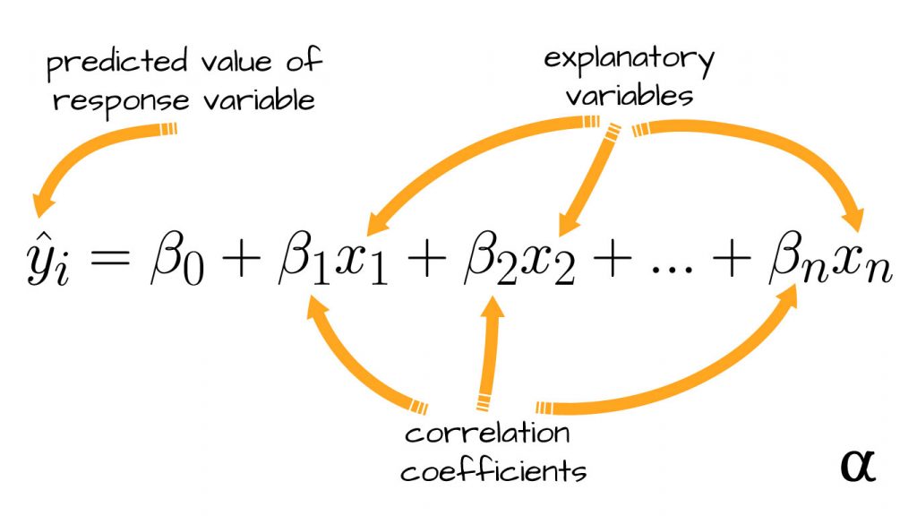
In this formula, there are a series of ß characters that represent correlation coefficients between a specific explanatory variable (x) and response variable (y). For example, the value of ß1 represents the correlation between x1 and y, ß2 represents the correlation between x2 and y, and so on.
Calculating the Correlation Coefficient
The correlation coefficients are calculated by summing the product of the error between observed values and the sample mean for each variable divided by the root of the sum of standard errors for those values. This calculation is expressed by the following equation:
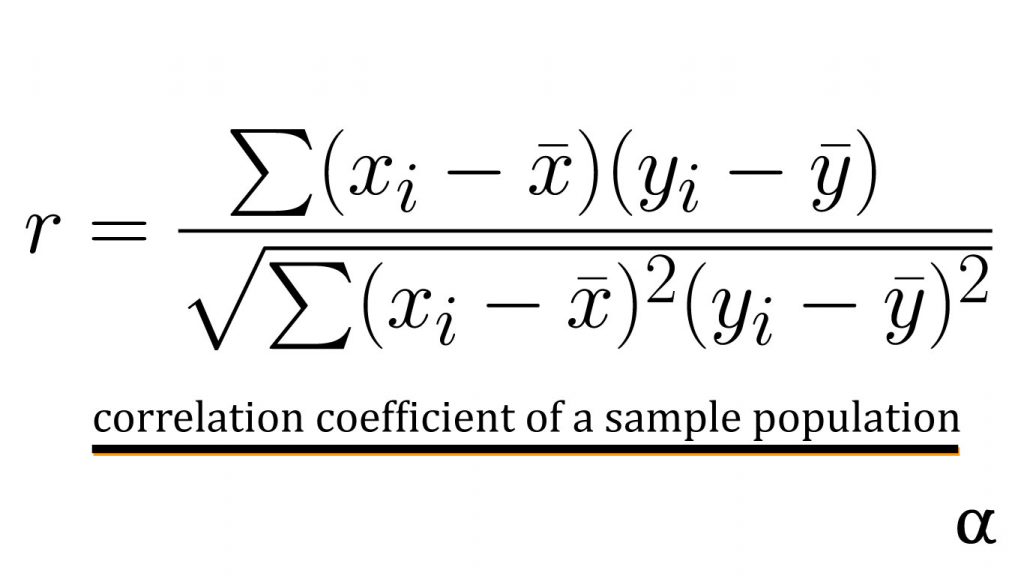
This equation represents the total correlation of observed values for two variables in a sample population. In simple linear regression, this would reflect the relationship between the single explanatory variable and the response variable.
In multiple linear regression, this measure can be calculated between different explanatory variables to better assess the appropriateness of their use in the model. In this case, a correlation matrix is often used.
Correlation Matrices
Correlation matrices are tables detailing the correlation coefficients between different variables in an easily visualized manner. A correlation matrix provides a sort of index where one can see how strong the correlation is among different variables.
Let’s consider the application of correlation matrices in identifying stocks that are linearly correlated. Below is some example code of using the yfinance Python library to retrieve historic pricing data for several large-cap tech stocks.
import yfinance as yf
import pandas as pd

# Have a list of tech stock tickers
tickers = ['msft', 'aapl', 'tsla', 'nvda', 'goog']

# Get 6-month historic quotes for tickers
df = yf.download(ticker=tickers, period='6mo')['Adj Close']

# Result
                  AAPL         GOOG        MSFT        NVDA        TSLA
Date
2021-01-22  138.627029  1901.050049  224.911453  137.046280  846.640015
2021-01-25  142.464767  1899.400024  228.474991  136.454132  880.799988
2021-01-26  142.704010  1917.239990  231.262131  134.275360  883.090027
2021-01-27  141.607513  1830.790039  231.829514  129.103348  864.159973
2021-01-28  136.653336  1863.109985  237.831787  130.435074  835.429993
...                ...          ...         ...         ...         ...
2021-07-15  148.479996  2625.330078  281.029999  189.662506  650.599976
2021-07-16  146.389999  2636.909912  280.750000  181.610001  644.219971
2021-07-19  142.449997  2585.080078  277.010010  187.797501  646.219971
2021-07-20  146.149994  2622.030029  279.320007  186.119995  660.500000
2021-07-21  145.399994  2652.010010  281.399994  194.100006  655.289978
The yfinance download() method provides Open-High-Low-Close (OHLC) data as Open, High, Low, Close, Volume, Adjusted Close by default. Here we’ve extracted just the Adjusted Close data for each stock at daily intervals going back 6-months.
Given these stocks are all from the same sector and among the most traded on the market there is a fair chance their prices will move together. That is, when $MSFT sees a price increase it’s likely that $GOOG will reflect a similar increase. That’s just guesswork though—let’s create a correlation matrix to validate our hypothesis.
# Use the pandas correlation coefficient function
>>> data.corr()

# Result
          AAPL      GOOG      MSFT      NVDA      TSLA
AAPL  1.000000  0.429290  0.708614  0.634802  0.407953
GOOG  0.429290  1.000000  0.894801  0.882468 -0.535120
MSFT  0.708614  0.894801  1.000000  0.911506 -0.218011
NVDA  0.634802  0.882468  0.911506  1.000000 -0.243408
TSLA  0.407953 -0.535120 -0.218011 -0.243408  1.000000
These results detail a cross-referenceable table of correlation coefficients between each stock’s adjusted closing price over a 6-month period. Notice the values of 1.0 moving diagonally from top-left to bottom-right. These reflect a perfect correlation because they reference the same stock. In other words, the correlation coefficient between $AAPL and $AAPL is 1.0 because it is always the exact same!
Interpretation
The correlation coefficients in this matrix fall within a range of -1 to 1 where -1 is a perfectly negative correlation, 0 is no correlation, and 1 is a perfectly positive correlation. Considering these values can allow one to identify different stocks whose prices move together—either positively or negatively.
There are varying schools of thought on how to interpret these results but, generally speaking, values above .7 and below -.7 are regarded as red flags indicating possible collinearity (Akoglu, 2018). In such cases, further investigation should be made to ensure resulting linear models have minimal error.
Correlation Matrix Heatmaps in Python
The table above is very insightful but is not the friendliest of formats when it comes to interpreting large datasets. Correlation matrices are useful for, among other applications, quick initial assessments of variables for applications such as feature engineering. In these cases, a more visual format know as a heatmap is used.
Both matplotlib and seaborn offer invaluable tools at generating these visualizations. Let’s generate a correlation matrix heatmap using seaborn to visually represent our pricing correlations.
import seaborn as sns
import matplotlib.pyplot as plt


# Define a nice color map for our heatmap
cmap = sns.diverging_palette(230, 20, as_cmap=True)

sns.heatmap(
        data=data.corr(),  # our correlation matrix
        linewidths=0.3,  # the width of lines separating the matrix squares
        square=True,   # enforce 1:1 ratios among correlation cells
        cmap=cmap,  # use the color map we defined above
        vmax=1,  # define the max of our correlation scale
        vmin=-1, # define the min of our correlation scale
        center=0,  # The value at which the color map is centered about (white)
        cbar_kws={"shrink": .75}  # shrink the scale a bit
    )

# adjust y-axis ticks for legibility
plt.yticks(rotation=0)

# show the heatmap
plot.show()
The above code goes through the following steps:
- Imports the necessary libraries
pyplotandseabornusingpltandsnsas conventions commonly specify; - defines a custom color palette to make things more visually pleasing to the eye;
- creates a heatmap figure via
seabornwith some customized parameters - adjusts the stock symbols on the y-axis for easier legibility
- opens the resulting image in the system’s default image viewer
This produces the following image;
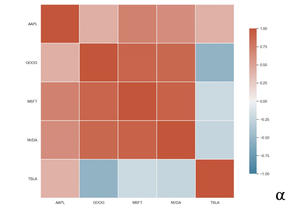
In this heatmap, the values that are closest to the dark brown represent stronger positive correlations. Those closer to the dark blue represent stronger positive negative correlations. Due to the nature of data organization in correlation matrices, there is a lot of redundant data. For example, every cell above the top-left to bottom-right diagonal is a duplicate of the lower half. We can reduce these by adding a mask to our code from before:
import numpy as np

# Generate Mask
mask = np.triu(np.ones_like(data.corr(), dtype=bool))
np.fill_diagonal(mask, False)  # keeps the diagonal

# Result of mask
[[False  True  True  True  True]
 [False False  True  True  True]
 [False False False  True  True]
 [False False False False  True]
 [False False False False False]]

# Creat heatmap with same syntax
# but add a "mask" argument
sns.heatmap(..., mask=mask, ...)
In this approach, we’ve created taken the following steps:
- Created a 2D array of boolean values in the same shape as our correlation matrix such that all cells above the diagonal get a value of True (to be masked)
- Added a value of False to the diagonal to ensure it is still displayed.
- Created the heatmap as before with a single additional argument (mask)
These additional steps result in the following image:
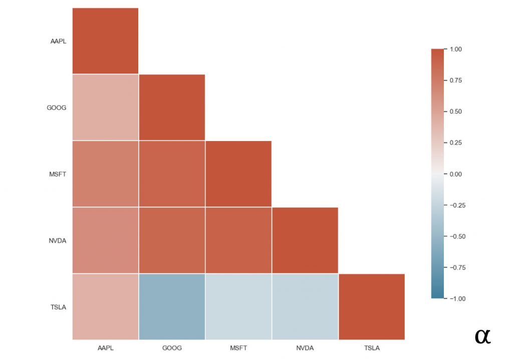
By removing the redundant data from our visualization we have created a much more efficient representation of the relationship between our tech stocks’ correlation coefficients. The insights from this mapping can help identify which features to use in applications such as predicting stock prices with linear regression or engineering features for more complex modeling.
Note: Including the diagonal here is still redundant but was elected for consideration of visual balance and completeness of data. One can always assume the diagonal to represent a perfect positive correlation.
Review
Correlation analysis can help determine when certain features may—or may not—be ideal choices for certain types of modeling like linear regression. Better understanding the relationship among variables offers valuable insight into the nature of one’s data and should be considered an essential step in preparing one’s data.
Whether developing simple linear regression models or more complex deep neural networks it is never a bad idea to better understand potential issues in the data. For resources on how to apply correlation analysis to modern machine learning algorithms check out this list of the machine learning and AI books available today compiled as a consensus from the most prominent voices in the field today.
References
- Akoglu, Haldun. “User’s guide to correlation coefficients.” Turkish journal of emergency medicine vol. 18,3 91-93. 7 Aug. 2018, doi:10.1016/j.tjem.2018.08.001


