Scatterplots are incredibly useful visualization tools for visualizing and analyzing data. The Pandas library in Python makes creating, saving, and customizing scatter plots incredibly simple.
Whether using scatter plots for initial inspection or more involved processes like linear regression—Pandas and Python make things a breeze! In this article, we’ll walk through the process of getting some sample data, plotting the data, and considering some easy ways to customize our visualization.
Highlights
- Using the
yfinancelibray to get some historical pricing data for stock pricing - Creating a basic scatterplot using the
pyplotmodule within matplolib - Considering some of the basic APIs of
matplotlibrary - Using the
matplotlabAPI to customize various parts of our visualization - Cover some additional APIs in
matplotlibfor data visualization
Matplotlib, PyPlot, and Pandas 101
Pandas is a powerful data science toolkit available for Python and is widely used by many modern data-intensive workflows. It is highly optimized to load, process, and output large amounts of data. Pandas come with an incredibly vast number of methods and classes to perform actions on data—including powerful visualization tools built on the matplotlib library.
The matplotlib.pyplot module is highly utilized when creating visualizations like scatter plots, histograms, and simple line charts in Pandas. Pandas offer some unique methods and features but, ultimately, allows the use of the matplotlib APIs as outlined in the official documentation.
While creating charts and graphs with matplotlib and Pandas is simple—there is a learning curve. The APIs are broad, often abbreviated oddly, and without ample documentation. Fortunately, getting a basic scatter plot to output is simple enough.
Getting Some Data
Before we start splashing dots onto the screen we need data. For this article we need data loaded into a Pandas DataFrame class to allow access to the matplotlib.pyplot.plot.scatter API. Just as is the case with most things Pandas-related—this is a breeze! In the code below we’ll load some historic stock pricing data and plot it on a scatterplot.
import yfinance as yf

# Download historic pricing data
nvda = yf.download('NVDA', period='3mo')

# Check the result
print(type(nvda))
print(nvda)

# Note the data is loaded as a DataFrame
<class 'pandas.core.frame.DataFrame'>

# Note the summary of the data

                  Open        High  ...   Adj Close    Volume
Date                                ...
2021-04-22  153.750000  154.384995  ...  148.468475  27778800
2021-04-23  149.342499  153.350006  ...  152.617523  22750000
2021-04-26  151.850006  154.789993  ...  154.744537  19779600
2021-04-27  155.785004  156.705002  ...  153.782257  16457200
2021-04-28  153.645004  155.322495  ...  152.732498  20941600
...                ...         ...  ...         ...       ...
2021-07-16  190.304993  191.570007  ...  181.610001  68822400
2021-07-19  179.152496  190.419998  ...  187.797501  74906000
2021-07-20  187.300003  188.380005  ...  186.119995  43424500
2021-07-21  188.820007  195.270004  ...  194.100006  37044200
2021-07-22  196.419998  198.869995  ...  194.565002  25553593

[64 rows x 6 columns]

# Drop all but two data columns
nvda = nvda[['Adj Close', 'Volume']]

# View result
print(nvda)

             Adj Close    Volume
Date
2021-04-22  148.468475  27778800
2021-04-23  152.617523  22750000
2021-04-26  154.744537  19779600
2021-04-27  153.782257  16457200
2021-04-28  152.732498  20941600
...                ...       ...
2021-07-16  181.610001  68822400
2021-07-19  187.797501  74906000
2021-07-20  186.119995  43424500
2021-07-21  194.100006  37044200
2021-07-22  194.664993  25614652

[64 rows x 2 columns]
Now we have a data frame object consisting of a DateTime index of two columns: Adj Close and Volume. Now we can plot our data using the built-in pyplot API accessors in Pandas.
Plotting the Data
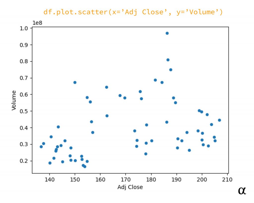
Using the historic pricing data for the Nvidia Corporation ($NVDA) we are going to use the adjusted closing price as our dependent variable (x) and the volume as our independent variable (y). We will specify these as arguments to the DataFrame.plot.scatter method and view our result. Consider the following example code:
# Create the plot
plot = nvda.plot.scatter(x='Adj Close', y='Volume')

# show the plot
plot.figure.show()
This code does two primary things:
- Tells Python to create a
matplotlib.pyplot.pltclass object via thePandas.plot.scatterAPI - Display the results of the scatter plot as a
.jpgimage (by default) via the system’s default image viewer.
This results in the following image:
Customizing the Scatterplot
This scatterplot is enough for quick analysis and can be used to find outliers, non-normal distributions, and identify issues such as multi-collinearity before building linear models. This may not be enough for those seeking more aesthetic visualizations. Let’s take a look at some easy ways to customize the scatterplot.
The scatterplot produced via Pandas makes available all the matplotlib scatter plot API options outlined in the official matplotlib documentation. Below are some cherry-picked implementations:
# Create the scatter plot with custom arguments
plot = nvda.plot.scatter(
    x='Adj Close', y='Volume',

    # <pyplot> class arguments
    figsize=(8, 6),

    # <scatter> plot class arguments
    s=48,
    marker='o',
    c='#ff9900',

    # <collection> class arguments
    edgecolors='black',
)

# Remove axis labels via plt.axes API
plot.axes.xaxis.label.set_fontsize(20)
plot.axes.yaxis.label.set_fontsize(20)

# Custom font + size via plot.axes API
plot.axes.xaxis.label.set_fontfamily('Monospace')
plot.axes.yaxis.label.set_fontfamily('Monospace')
plot.axes.set_xticklabels(labels=[])
plot.axes.set_yticklabels(labels=[])

# Show the plot
plot.figure.show()
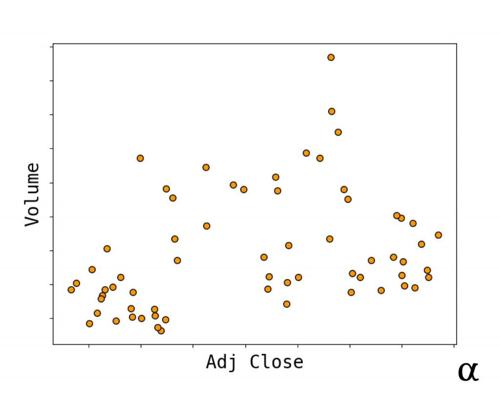
This code does several things in a cumbersome way:
- Customizes the size of the image to 8″ x 6″
- Increases the marker size
- Specifies a custom marker type
- Creates a custom color for the marker
- Outlines the marker in black
- Removes the values from the X and Y axes
- Customizes font + size of the axis labels
These specifications result in the following scatterplot:
For more ideas on how to customize the Pandas scatter plot (and other plot types) checkout the methods outlined in the following matplotlib documentation files:
Review
Generating scatter plots in Python is simple using the Pandas or matplotlib library. Given the Pandas library utilizes the matplotlib library under the hood—it pays to be familiar with its APIs if seeking to create customized visualizations. For ideas on other cool ways to visualize data with Pandas check out our article about autocorrelation and time series plots as well as our article about creating heatmaps for correlation matrices in Python. With access to so many powerful data analysis and visualization tools it’s no wonder that Python continues to reign atop the lists of most popular programming languages year after year.


