The stochastic oscillator is a momentum indicator used to signal trend reversals in the stock market. It describes the current price relative to the high and low prices over a trailing number of previous trading periods. Implementing the stochastic oscillator in python offers many advantages in algorithmic trading.
In this article, we’ll cover the basics of the stochastic oscillator, how it’s calculated, how to interpret the results, and how to create a Stochastic Oscillator chart in Python using Plotly. To round things out, we’ll implement a basic stochastic oscillator algorithm to backtest on historic pricing data.
Highlights
- How each aspect of the stochastic oscillator is calculated
- What the different signals of the SO mean and how to interpret them
- Getting historic pricing data in Python and adding the necessary calculations for the fast and slow stochastic signal lines
- Creating a stochastic oscillator chart and pricing Candlestick chart using Plotly
- Developing and implementing a basic algorithmic trading strategy using the signals generated by the stochastic oscillator over a given trading period.
- Implementing the algorithm and backtesting against several different stocks over varying periods of time to analyze the performance
Stochastic Oscillator 101
The Stochastic Oscillator was developed by Dr. George Lane in the 1950s and has been used as a technical indicator for stock trading ever since. Its popularity is attributable to its relative ease of interpretation and track record of success. This indicator is often plotted below pricing charts to help provide clear visual signals for trading actions.
The stochastic oscillator has 2 primary signals that work to build a trading signal. These signals, referred to as the fast and slow signals, oscillate between values of 0 and 100. Within this range, there are certain threshold levels used to describe buying and selling pressure. Typically, these are set to 20 (oversold) and 80 (overbought). Consider the chart below:
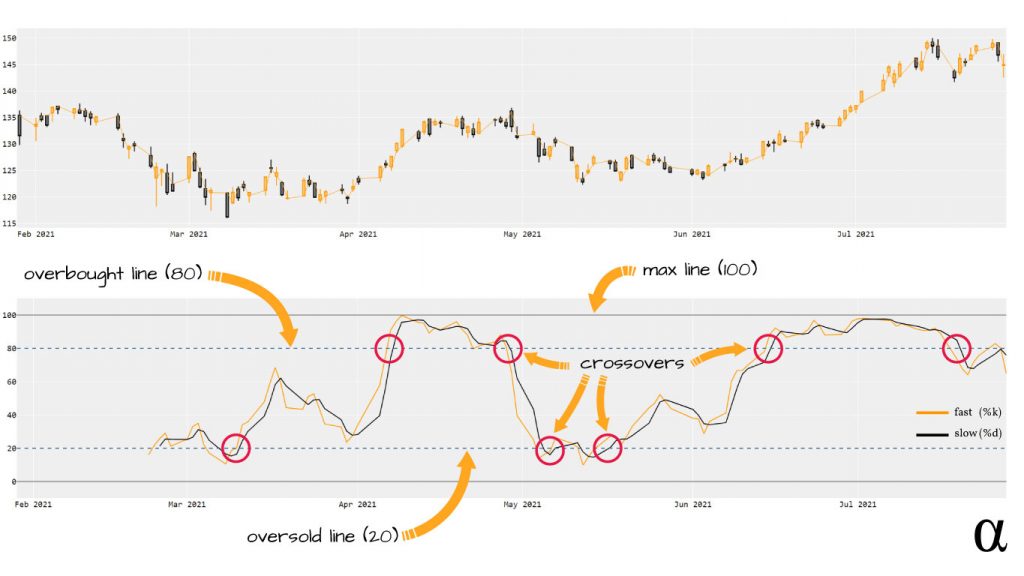
The chart on the bottom represents the Stochastic Oscillator for $AAPL over a 6-month period. The yellow line is the %k (fast) line and the black line is the %d (slow) line. The fast line represents a possible shift in price. The %d is a Simple Moving Average (SMA) of the %k line that offers a less reactive, smoother representation of relative pricing. The dashed lines represent the overbought and oversold status.
Buy signals are generated where the %k and %d are near or below the 20-line and Sell signals are generated where the %k and %d are near or above the 80-line. In the chart above, the red circles represent buy/sell signals.
We’ll get into the finer points of interpreting these values later. For anyone wanting a more technical description, check out the article Stochastic Oscillator: Predicting Trend Reversals for Better Entries in Trading. For now, let’s consider how to calculate the stochastic oscillator in Python!
Getting Historic Pricing Data in Python
The stochastic oscillator is a momentum indicator that takes into account n-many previous values over a time series. That’s the technical definition; in plainer language the SO uses the price from previous trading days to describe how near the current price is to the high-low range over those days. To make this calculation, we need to know three things:
- The current pricing data for a stock;
- The number of previous days for which we want to consider pricing;
- The high and low pricing data for each day during that period.
Python offers a number of tools for making statistical calculations. As with any calculation, manually implementing a function to generate the desired output is possible. We’re taking a different route here—leveraging the power of Pandas, pandas_ta, and the yfinance libraries to make our lives easier.
import yfinance as yf
import pandas_ta as ta

# get historical pricing data
df = yf.Ticker('nvda')
df = df.history(period='6mo')[['Open', 'High', 'Low', 'Close']]

# Result
                  Open        High         Low       Close
Date
2021-01-29  130.674941  133.270953  129.040885  129.822937
2021-02-01  130.457567  132.631322  128.953426  132.294006
2021-02-02  133.910575  135.642079  132.778718  135.489670
2021-02-03  136.281712  139.237519  135.087391  135.227310
2021-02-04  135.232317  136.656502  133.300931  136.564056
...                ...         ...         ...         ...
2021-07-22  196.419998  198.869995  192.759995  195.940002
2021-07-23  196.559998  197.000000  192.500000  195.580002
2021-07-26  193.110001  194.419998  189.139999  192.940002
2021-07-27  192.649994  196.220001  187.410004  192.080002
2021-07-28  193.190002  196.460007  189.949997  195.029999

[125 rows x 4 columns]
Here we’ve used the yfinance library to request the previous 6-months pricing history for $NVDA. This request uses the finance.yahoo.com public API and returns as Pandas DataFrame object. The second line ensures we have only the columns that we need to calculate and visualize the Stochastic Oscillator during this trading period. Printing the DataFrame object reveals 125 rows of historic pricing data.
Calculating the Stochastic Oscillator in Python
We can now calculate the stochastic oscillator using the values from our historic data. The first step is to choose how many previous days we want to use to generate our fast signal (%k).
A value of 14 periods is the most common choice here so that’s what we’ll be using. With that, we’ll calculate the %k (fast) which we will then use to calculate the %d (slow). Let’s see how this can be done with native DataFrame methods:
# Define periods
k_period = 14
d_period = 3

# Adds a "n_high" column with max value of previous 14 periods
df['n_high'] = df['High'].rolling(k_period).max()

# Adds an "n_low" column with min value of previous 14 periods
df['n_low'] = df['Low'].rolling(k_period).min()

# Uses the min/max values to calculate the %k (as a percentage)
df['%K'] = (df['Close'] - df['n_low']) * 100 / (df['n_high'] - df['n_low'])

# Uses the %k to calculates a SMA over the past 3 values of %k
df['%D'] = df['%K'].rolling(d_period).mean()

# Result
                  Open        High         Low       Close      n_high  \
Date
2021-01-29  130.674941  133.270953  129.040885  129.822937         NaN
2021-02-01  130.457567  132.631322  128.953426  132.294006         NaN
2021-02-02  133.910575  135.642079  132.778718  135.489670         NaN
2021-02-03  136.281712  139.237519  135.087391  135.227310         NaN
2021-02-04  135.232317  136.656502  133.300931  136.564056         NaN
...                ...         ...         ...         ...         ...
2021-07-22  196.419998  198.869995  192.759995  195.940002  208.750000
2021-07-23  196.559998  197.000000  192.500000  195.580002  208.750000
2021-07-26  193.110001  194.419998  189.139999  192.940002  208.750000
2021-07-27  192.649994  196.220001  187.410004  192.080002  205.327499
2021-07-28  193.190002  196.460007  189.949997  195.029999  205.327499

                 n_low         %K         %D
Date
2021-01-29         NaN        NaN        NaN
2021-02-01         NaN        NaN        NaN
2021-02-02         NaN        NaN        NaN
2021-02-03         NaN        NaN        NaN
2021-02-04         NaN        NaN        NaN
...                ...        ...        ...
2021-07-22  178.654999  57.434800  44.520137
2021-07-23  178.654999  56.238586  54.998075
2021-07-26  178.654999  47.466367  53.713251
2021-07-27  178.654999  50.332750  51.345901
2021-07-28  178.654999  61.392819  53.063979

[125 rows x 8 columns]
This approach uses the DataFrame.rolling() method to tell Python to use the previous 14 values for calculation. We then use the max() and min() functions to get our min/max for that 14-day period. These values are appended to new columns in our DataFrame and made available for future calculations.
Next, we use the formula for calculating the %k as a percentage of the min/max for the previous trading days. This will return a value between 0-100 a reflect the price relative to the preceding min/max values.
Next, we use the values generated for the %k to calculate a simple moving average over the previous 3-periods for which %k was calculated. There will be a two-period gap (assuming we’re using the 3-period window) between our %k and %d where there were not enough values for %k to calculate %d. Alternatively, we could have done this via the pandas_ta library as such:
import pandas_ta as ta

# Add some indicators
df.ta.stoch(high='high', low='low', k=14, d=3, append=True)

# Result
                  open        high         low       close  STOCHk_14_3_3  \
date
2021-01-29  130.674941  133.270953  129.040885  129.822937            NaN
2021-02-01  130.457567  132.631322  128.953426  132.294006            NaN
2021-02-02  133.910575  135.642079  132.778718  135.489670            NaN
2021-02-03  136.281712  139.237519  135.087391  135.227310            NaN
2021-02-04  135.232317  136.656502  133.300931  136.564056            NaN
...                ...         ...         ...         ...            ...
2021-07-22  196.419998  198.869995  192.759995  195.940002      44.520137
2021-07-23  196.559998  197.000000  192.500000  195.580002      54.998075
2021-07-26  193.110001  194.419998  189.139999  192.940002      53.713251
2021-07-27  192.649994  196.220001  187.410004  192.080002      51.345901
2021-07-28  193.190002  196.460007  189.949997  195.029999      53.063979

            STOCHd_14_3_3
date
2021-01-29            NaN
2021-02-01            NaN
2021-02-02            NaN
2021-02-03            NaN
2021-02-04            NaN
...                   ...
2021-07-22      33.154337
2021-07-23      45.006561
2021-07-26      51.077154
2021-07-27      53.352409
2021-07-28      52.707710

[125 rows x 6 columns]
This gives us two new columns: STOCHk_14_3_3 (%k) and STOCHd_14_3_3 (%d), doesn’t bother us with the high/low columns, and only takes a single line of code. The best part? We don’t have to bother ourselves with remembering the stochastic oscillator formula! The pandas_ta library really proves itself useful when adding multiple indicators at once—though its use here is completely optional.
Creating a Stochastic Oscillator Chart in Python
This new data is all one needs to algorithmically generate trading signals—numbers in, signals out. That’s all well and good, but it doesn’t offer much in the way of visualizing our trading strategy. For that, we’ll want to create charts of both our pricing data and our stochastic oscillator values.
These charts can be created using any number of visualization libraries. I’ve elected to use Plotly as I find its API and syntax more intuitive than matplotlib. We’ll be using Plotly to create the following charts:
- A Candlestick chart showing the pricing data over our trading period
- A Stochastic Oscillator chart showing our %k, %d, and 80/20 lines over that same period.
To accomplish this we’ll be using Plotly’s subplot features and graph_objects methods. There’s a number of layout settings and figure attributes that are required but we won’t worry too much about their specifics here. Let’s start walking through the code:
import plotly.graph_objects as go
from plotly.subplots import make_subplots

# Avoid case-sensitive issues for accessing data.
# Optional if using pandas_ta
df.columns = [x.lower() for x in df.columns]

# Create our primary chart
# the rows/cols arguments tell plotly we want two figures
fig = make_subplots(rows=2, cols=1)

# Create our Candlestick chart with an overlaid price line
fig.append_trace(
    go.Candlestick(
        x=df.index,
        open=df['open'],
        high=df['high'],
        low=df['low'],
        close=df['close'],
        increasing_line_color='#ff9900',
        decreasing_line_color='black',
        showlegend=False


    ), row=1, col=1  # <------------ upper chart
)

# price Line
fig.append_trace(
    go.Scatter(
        x=df.index,
        y=df['open'],
        line=dict(color='#ff9900', width=1),
        name='open',

    ), row=1, col=1  # <------------ upper chart
)

# Fast Signal (%k)
fig.append_trace(
    go.Scatter(
        x=df.index,
        y=df['stochk_14_3_3'],
        line=dict(color='#ff9900', width=2),
        name='fast',

    ), row=2, col=1  #  <------------ lower chart
)

# Slow signal (%d)
fig.append_trace(
    go.Scatter(
        x=df.index,
        y=df['stochd_14_3_3'],
        line=dict(color='#000000', width=2),
        name='slow'
    ), row=2, col=1  <------------ lower chart
)

# Extend our y-axis a bit
fig.update_yaxes(range=[-10, 110], row=2, col=1)

# Add upper/lower bounds
fig.add_hline(y=0, col=1, row=2, line_color="#666", line_width=2)
fig.add_hline(y=100, col=1, row=2, line_color="#666", line_width=2)

# Add overbought/oversold
fig.add_hline(y=20, col=1, row=2, line_color='#336699', line_width=2, line_dash='dash')
fig.add_hline(y=80, col=1, row=2, line_color='#336699', line_width=2, line_dash='dash')

# Make it pretty
layout = go.Layout(
    plot_bgcolor='#efefef',
    # Font Families
    font_family='Monospace',
    font_color='#000000',
    font_size=20,
    xaxis=dict(
        rangeslider=dict(
            visible=False
        )
    )
)
fig.update_layout(layout)

# View our chart in the system default HTML viewer (Chrome, Firefox, etc.)
fig.show()
That seems like a lot of code but it’s mostly parameters, optional arguments, excess comments, and ample use of newline spacing. The only real fluff we’ve added is reflected in the last several lines where we’ve updated the Layout options to specify a different background color, different font, and font size, and to remove the range slider (a default Plotly feature.) This will launch an interactive HTML document in our system browser that looks like this:
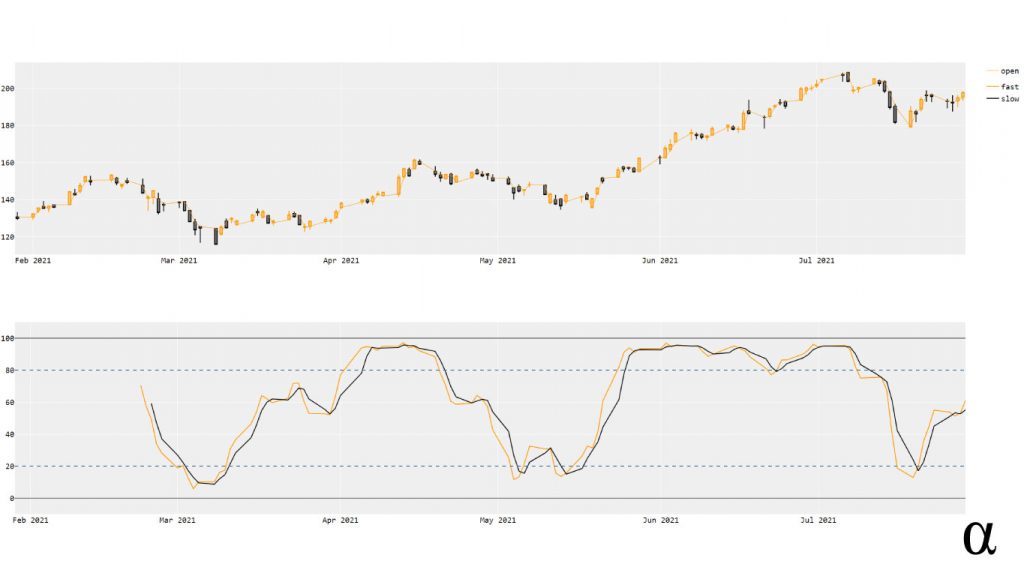
Now we have a clear visualization of the Stochastic Oscillator during our trading period. Note there is a significant omission of data on the leftmost side of the lower chart. This reflects the 14-day period over which our %k value is generated. During that period, we don’t have prior data to generate the %k for so we end up with a NaN value (Pandas-speak for shit-outta-luck).
This gap in data is expected and helps us realize that, for any single trading day on which we want to reference the stochastic indicator, we need 14 days for the %k and an additional 3 for the %d. Now that we have a clear visualization of our data let’s consider how we might interpret these results to develop an algorithmic trading strategy over this period of time.
Algorithmic Trading Strategy
To develop our strategy we need to first consider what signals we have to work with and what they mean. In simple terms the Stochastic Indicator can be interpreted as such:
- %k higher than %d indicates a potential upward shift in price
- %k and %d above the 80-line indicate an overbought market
- %k and %d below the 20-line indicate an oversold market
Putting these together, we can formulate a general trading algorithm as reflected by the following pseudocode:
# Overbought status
if k > 80 and d > 80 and k < d:
    sell

# Oversold status
else if k < 20 and d < 20 and k > d:
    buy

# Something in the middle
else:
    do nothing
This is very generalized algorithmic approach to trading with the stochastic oscillator. Running this algorithm over a backtesting period of 6 months for $AAPL we generate a measly 1.06% return. Let’s test it out on some other stocks over some longer periods. Below is a summary of results from using our new stochastic Indicator algorithm on several stocks:
| Symbol | Period | % Return |
|---|---|---|
| AAPL | 5-Year | 10.77 |
| NFLX | 5-Year | 12.8 |
| MSFT | 5-Year | 7.05 |
| NVDA | 5-Year | 10.64 |
| FB | 5-Year | 7.16 |
| GOOG | 5-Year | 14.21 |
As we can see, the longer trading period seems to reflect greater returns—likely due to the increased number of trade opportunities. That’s a good sign that our algorithm would be profitable given a long enough timeline. A range of ~7-14% total return over a 5-year period isn’t anything to write home about—but it’s a good place to start!
Review
In this article, we’ve covered the basics of calculating the Stochastic Oscillator, how to interpret it, how to visualize it, and even how to implement it into a basic algorithmic trading strategy. The steps taken in our approach represent only several of many options in calculating and visualizing this technical indicator. I’m a fan of using the pandas_ta library—mostly because I like to use several indicators—but it is certainly not required.
The returns generated by our casual implementation reinforce some key advice I hear echoed by many traders: don’t rely on a single indicator! There are dozens of common technical indicators used by traders. Combining several, using one to confirm the other, or even using them as features in more complex predictive models such as linear regression can all lead to more profitable trading strategies.


