Plotting data in Python is easy when using Matplotlib. Plotted figures will often reflect automatically-determined axis markers (a.k.a. tick marks) based on values passed from datasets. To limit the number of ticks or control their frequency, some explicit actions must be taken
Matplotlib is the defacto data visualization library for Python. It provides user-friendly, high-level APIs for creating such data visualizations as scatter plots, bar charts, histograms, and even more nuanced plots such as contour maps and triangular interpolation plots.
Sample Data via Random Number Generation
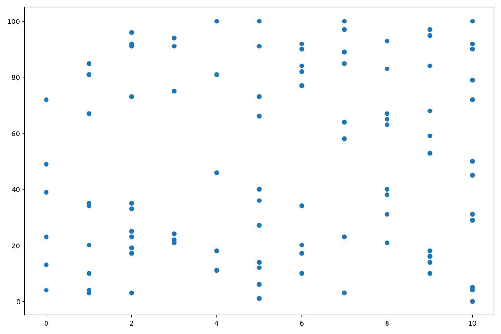
To get started we’re going to generate the random data shown in the image above and plot it using the matplotlib.pyplot.scatter class. This plot reflects an x-axis tick amount of every other value within the x-axis min, max range (even number from 0-10). The following code will accomplish this:
import matplotlib.pyplot as plt
import random

# Generate 100 random x-values between 0 and 10, inclusive
x = [random.choice(list(range(11))) for _ in range(100)]

# Generate 100 random y-values between 0 and 100, inclusive
y = [random.choice(list(range(101))) for _ in range(100)]

# Create the scatter plot
plt.scatter(x=x, y=y)

# Show the plot
plt.show()
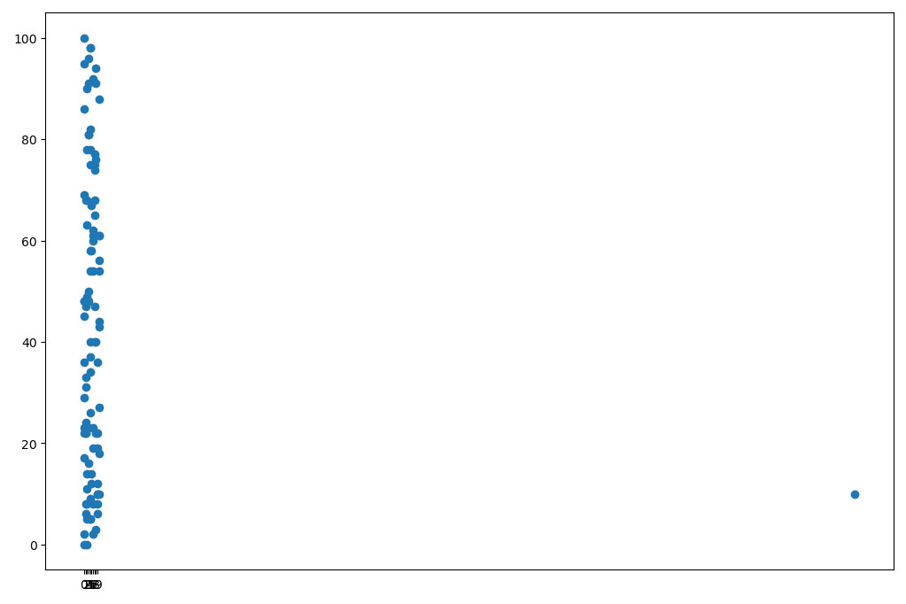
This data reflects a pretty even distribution and doesn’t do well to illustrate the need for limiting axis ticks or axis tick frequency. Let’s add an annoying outlier by the following: x.append(512); y.append(10) and see how the plot is affected:
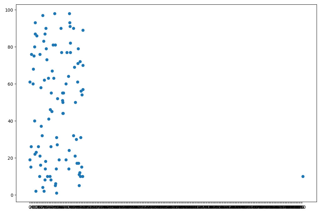
Can you read those scrunched-up tick values on the x-axis? While this is a very contrived example, I’ve often run into this issue when plotting a range of data such as product prices—because there’s always those geniuses on marketplaces that believe a 100x markup will fool someone. Who knows, maybe they’re right!
Control Tick Mark Frequency
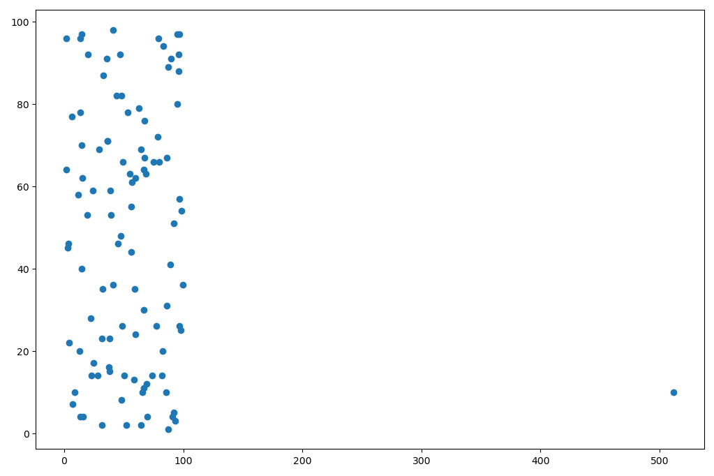
Here we seen the outlier point, plotted in the lower right hand of the figure at (1024, 10). However, this figure shows x-axis tick marks every 100 values which makes it much more reader-friendly. To achieve this effect, implement the following line of code:
plt.xticks(range(0, int(max(x)), 100))
This makes use of the xticks function that either gets or sets the tick locations and labels of a given axis. There are xticks and yticks that can be easily accessed. Either the xticks or yticks functions take the following arguments:
- ticks – an array-like object of
xticklocations - labels – an array-like object of
yticklocations .Textproperties to control display options of labels (as**kwargs)
The important thing to note here is that the tick values are explicitly defined. In this case, the tick marks are generated via a range(0, 512, 100)equivalent argument. This means a range between 0-512 at a frequency of every 100. Read the Python documentation for range for a better explanation of this functionality.
What this really means is that you’ll end up with a nonsensical plot if you don’t ensure a sensible relationship between your data and the ticks argument. Kind of like the one below, which used a range(0, 10, 1) argument for xticks.
Final Thoughts
Control axis tick frequency in matplotlib can help better visualize distributions of data. However, there’s plenty of times where there exist too many values to display, hinting at the need to limit their display. The xticks and yticks functions fit the bill here, as shown in the figures above, but require some premeditation to ensure sensible display.
In the examples shown here, especially the one with the outlier datapoint, other approaches such as data sanitization, preprocessing, and filtering may prove beneficial. For example, I’d likely strike the (1024, 10) point from the record before plotting. Well, after plotting once anyway!
A common alternative to using the range(min, max, freq) specification is to use them numpy.arange(min, max+1, 1.0) which is a functional equivalent. The standard library’s range function was used here purely out of preference and familiarity. As usual, programming in Python makes this whole process a breeze.


