Boostrap is arguably one of the most popular CSS frameworks on the market today1. Originally developed by Twitter2, Boostrap provides market-leading responsive CSS elements used in modern web design. The mobile responsive aspect of Boostrap is powered by the underlying grid system.
This grid system responds to CSS media queries, adjusting the sizing and positioning of elements to accommodate changes in screen size. In this tutorial, we’ll construct a basic page layout using the Bootstrap grid system that is responsive and optimized for viewing on smartphones, tablets, laptops, and desktops.
Note: The code for this tutorial is available via Github here. A working demo of the final product can be viewed here.
Quick Intro: Boostrap, CSS, HTML, & Prerequisites
Boostrap has a lot of features ranging from navigation elements, and tabbed content sections, all the way to JavaScript-powered elements. This tutorial will focus on the bootstrap Grid system and requires no preexisting knowledge.
Some basic knowledge of HTML, CSS, and development tools will be assumed. If unfamiliar with basic HTML structure, CSS concepts, or running a development server please visit the following resources prior to diving in:
Regarding point 3, any means of serving an HTML file will suffice. Other options would include an IDE such as Webstorm or VSCode that has that functionality built-in or available via a plugin. This tutorial is intended to be basic, generalizable, and as light on theory and complexity as possible. One can certainly survive without knowing any of the above in-depth.
Project Goals
Before digging in deeply let’s discuss the goals of this tutorial and what to expect. That way you can avoid wasting time if it doesn’t meet your goals. First — this tutorial is slightly opinionated in asserting the type of layout that is created. It will be responsive, use Boostrap V5, and be well-suited for applications like blog posts, articles, or project pages. Below is a visual representation of what our final project will be:
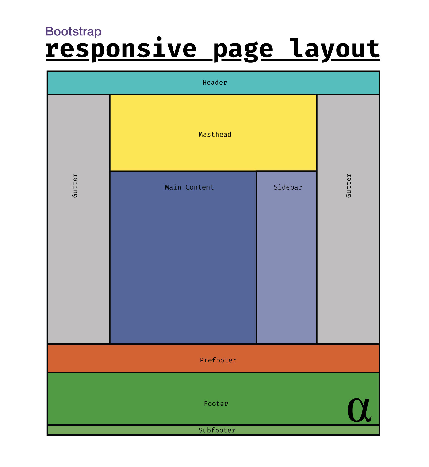
This would be well-suited to accommodate a blog post, a featured project on a portfolio website, or even perhaps even a product on an e-commerce page. The sidebar element will accommodate “sticky” functionality as will the header. The design will also feature a mobile navigation menu that appears when the screen is below a certain width.
Project Setup
This project will be structured like a basic HTML project without the use of any fancy frameworks like React, View, Angular, Django, etc. This project is simple enough that one could code this project entirely using Notepad. To get set up we create the following project structure:
.
└── project/
    ├── index.html
    └── style.css
The contents of index.html are boilerplate at this point apart from loading style.css in the <head> section. Below are the contents of index.html:
<!DOCTYPE html>
<html lang="en">
<head>
    <meta charset="UTF-8">
    <meta name="viewport" content="width=device-width, initial-scale=1">
    <title>Boostrap Responsive Page Layout</title>
    <link rel="stylesheet" href="style.css" type="text/css"/>
</head>
<body>

</body>
</html>
One more component we need is the Boostrap CSS styles. Here we come to our first major design decision. Bootstrap is a framework that has a lot of different components — many of which will not be used here.
Adding Bootstrap
Among the many features of Bootstrap come icons, JavaScript, custom utility classes, and even element stylings. These are useful for building an entire set of website features including dropdown menus, hover effects, and other common elements that are chosen on a case-by-case basis.
We are only going to use two discrete components of Boostrap, taken from the Official Boostrap Github Repository:
boostrap.grid.min.css– the core grid layout CSS styles, pre-compiled and minified.boostrap-reboot.min.css– basic HTML/CSS page resets to normalize visual presentation across different browsers.
Our project directory now reflects the following structure:
.
└── project/
    ├── index.html
    ├── style.css
    ├── bootstrap-grid.min.css
    └── bootstrap-reboot.min.css
The index.html file is now updated to load these as such:
<!DOCTYPE html>
<html lang="en">
<head>
    <meta charset="UTF-8">
    <meta name="viewport" content="width=device-width, initial-scale=1">
    <title>Boostrap Responsive Page Layout</title>
    <link rel="stylesheet" href="boostrap-reboot.min.css" type="text/css"/>
    <link rel="stylesheet" href="boostrap.grid.min.css" type="text/css"/>
    <link rel="stylesheet" href="style.css" type="text/css"/>
</head>
<body>

</body>
</html>
Notice we have added two <link> elements in the head section. These need to be included before the link to style.css since that file will contain custom CSS definitions that are dependent on Bootstrap styles.
Adding HTML Elements
This project focuses on creating an opinionated set of basic HTML5 elements that are styled using the Boostrap CSS framework. These elements, combined with Boostrap’s grid framework, will provide us with a page containing sections common to popular layout designs. Below is a generalized tree diagram of the layout we will design:
.
└── html/
    ├── head
    └── body/
        ├── header
        ├── main/
        │   ├── section (masthead)
        │   └── section (main content)/
        │       ├── article
        │       └── sidebar
        ├── prefooter
        ├── footer
        └── subfooter
This project will reflect minimal content being added as our focus is on the structure. However, without some basic content and styling, we’ll only ever see a blank white screen. We will add some CSS variables (custom parameters), hard-code some element height values, and provide some basic aesthetics such as border and background colors to visualize our HTML elements. We’ll limit all these to the vibes class applied to thebody element so we can easily toggle them on/off. Below is the initial HTML code for our design:
<!DOCTYPE html>
<html lang="en">
  <head>
    <meta charset="utf-8" />
    <meta name="viewport" content="width=device-width, initial-scale=1" />
    <title>alphaweb - A Bootstrap Template</title>
    <link rel="stylesheet" href="boostrap-reboot.min.css" type="text/css"/>
    <link rel="stylesheet" href="boostrap.grid.min.css" type="text/css"/>
    <link rel="stylesheet" href="style.css" type="text/css"/>
  </head>
  <body class="vibes">

    <!-- main nav bar area -->
    <header>

      <!-- Desktop/Laptop Menu -->
      <nav id="mainNav" class="container-fluid navbar"></nav>

      <!-- Mobile/Tablet Menu -->
      <nav id="mobileNav" class="container-fluid navbar"></nav>
    </header>

    <!-- primary content area -->
    <div class="page-wrapper">
      <main>

        <!-- Masthead -->
        <section class="container-fluid">
          <div id="masthead" class="container"></div>
        </section>

        <!-- Primary Content Area -->
        <section id="mainContent" class="container-fluid">
          <div class="container">
            <div class="row">

              <!-- Sidebar -->
              <aside id="sidebar" class="col-md-3 order-2"></aside>

              <!-- article/content -->
              <article id="content" class="col-md-9 order-1"></article>

            </div>
          </div>
        </section>
      </main>


      <!-- Footer Areas -->
      <div class="footer-wrapper">

        <!-- Prefooter -->
        <section id="prefooter" class="container-fluid"></section>

        <!-- Footer -->
        <footer class="container-fluid">

          <!-- footer menu area -->
          <div id="footerPrimary" class="container">
          </div>

          <!-- subfooter menu area -->
          <div id="subFooter" class="container">
          </div>

        </footer>

      </div>
    </div>

  </body>
</html>
I’m going to let the code speak for itself for the most part. However, let’s discuss some of the more opinionated design decisions:
sectionelements: These could easily bedivelements instead.main: not required; simply used to indicate the main section of content on the bad exclusive of theheaderandfooterareaspage-wrapper: this is something we’ll use use CSS to stick the footer to the bottom of the page.footer: This element is wrapped up along with anothersectionelement (#prefooter) into a “wrapper”divto allow us to force the entire footer/prefooter elements to the bottom of the page (a.k.a. sticky footer)aside: The sidebar could as easily be adivelement. Theasideelement generally expresses content that’s not the primary focus of the page.article: Perhaps not relevant for all pages; this element conveys this area is the main unique content on the page. Also not required.navelements for the desktop and mobile menu are only parent containers currently — we will add structure and functionality later.
The use of the elements in such a way is common in my experience but certainly not necessary. These elements, as well as their respective hierarchical ordering, allowing robust control over how they display across varying device widths.
Adding CSS Styling
Our HTML layout is off to a good start but the entire page will still render blank white if launched in a browser. To fix this, we’ll add some basic CSS styling. Our styles fall into one of two categories:
- Essential for page layout and functionality;
- Solely for aesthetic and demonstrative purposes.
First, let us consider the core CSS code that’s added to ensure the elements display as intended. The code below illustrates this and is commented where relevant:
/** Force footer to bottom of page **/
body {
    display: flex;
    flex-direction: column;
}
.footer-wrapper {
    margin-top: auto;
}
.page-wrapper {
    margin-top: var(--alpha-header);
    min-height: calc(100vh - var(--alpha-header));
    display: flex;
    flex-direction: column;
}

/** Defines the height and stickiness of navbar **/
.navbar {
    height: var(--alpha-header);
    position: fixed;
    padding: 1rem 0;
    align-items: center;
    display: flex;
}

/** controls which navbar to show based on screen width **/
@media screen and (min-width: 768px) {
    #mobileNav {
        display: none;
    }
}
@media screen and (max-width: 767px) {
    #mainNav {
        display: none;
    }
}
The @media queries are used to show/hide the mobile and desktop navigation menus based on screen width. The header’s styling ensures the navigation bar — be it mobile or desktop — stays positioned at the top of the page. The .footer-wrapper styles ensure the footer and prefooter sections stay at the bottom of the page. Check out this article for more options there. The following styles are used only for demonstration purposes and can be eliminated by removing the vibes class from the body element:
:root {
    --alpha-blue: #546699;
    --alpha-yellow: #fee355;
    --alpha-grey: #c0bfbf;
    --alpha-aqua: #58bdbd;
    --alpha-purple: #868cb3;
    --alpha-red: #d06233;
    --alpha-green: #519943;
    --alpha-unit: 32px;
    --alpha-header: calc(3 * var(--alpha-unit));
}
/** demo styling **/
body.vibes footer, body.vibes aside, body.vibes article, body.vibes header, body.vibes #prefooter,
body.vibes #masthead, body.vibes body, body.vibes #mainNav, body.vibes #mobileNav {
    -webkit-box-shadow: inset 0px 0px 0px 4px #000;
    -moz-box-shadow: inset 0px 0px 0px 4px #000;
    box-shadow: inset 0px 0px 0px 4px #000;
}
body.vibes body {
    background: var(--alpha-grey);
}
body.vibes header {
    background-color: var(--alpha-aqua);
}
body.vibes #masthead {
    background-color: var(--alpha-yellow);
    height: calc(8 * var(--alpha-unit));
    justify-content: center;
    text-align: center;
}
body.vibes #content {
    background-color: var(--alpha-blue);
    height: calc(24 * var(--alpha-unit));
    display: flex;
    justify-content: center;
    align-items: center;
}
body.vibes #sidebar {
    background: var(--alpha-purple);
    display: flex;
    justify-content: center;
    align-items: center;
    text-align: center;
    min-height: 300px;
}
body.vibes #prefooter {
    background: var(--alpha-red);
    justify-content: center;
    text-align: center;
    min-height: 192px;
}
body.vibes footer {
    background: var(--alpha-green);
    min-height: 300px;
}
body.vibes #mainNav {
    background: var(--alpha-green);
}
body.vibes #mobileNav {
    background: var(--alpha-red);
}
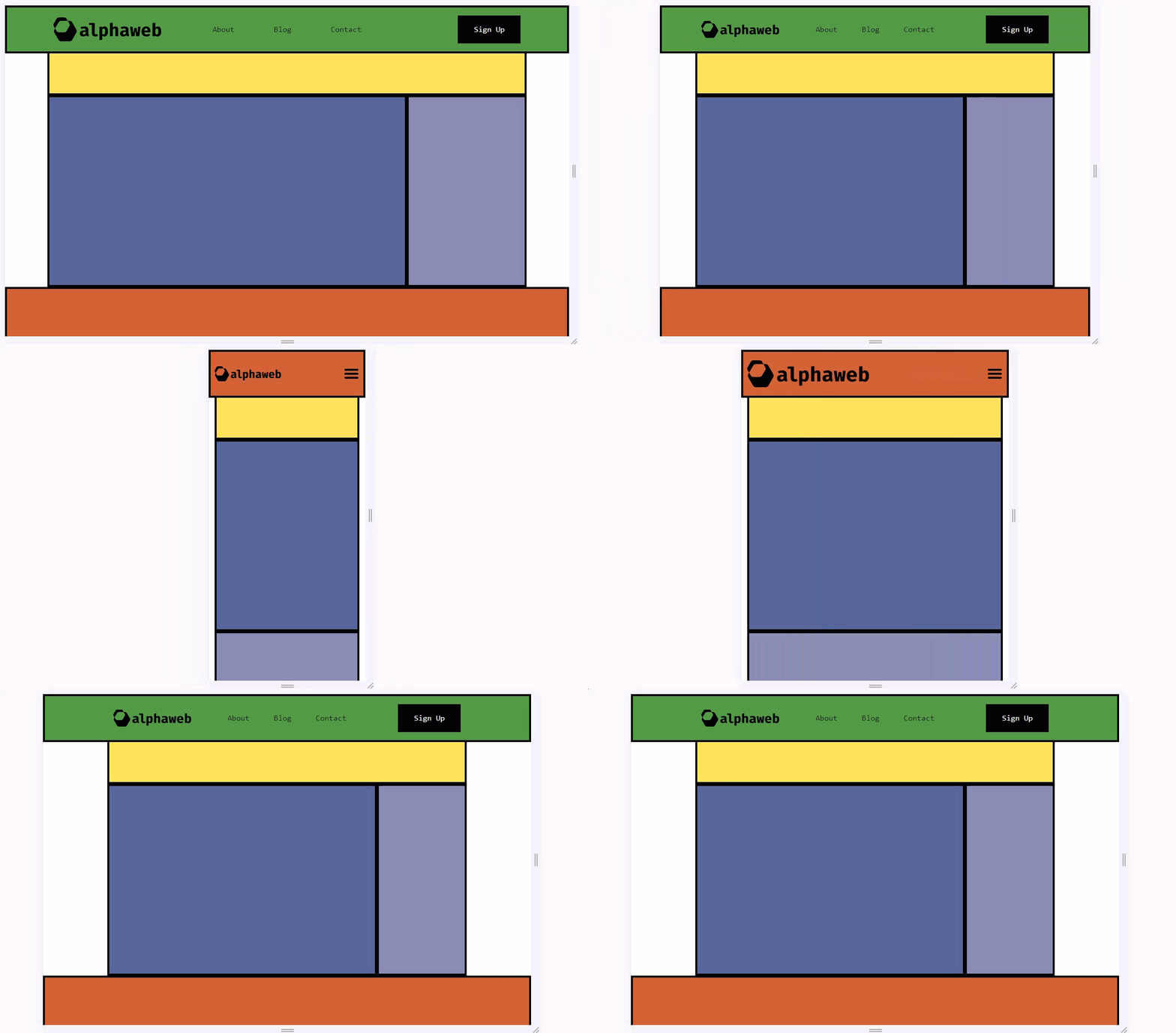
With the HTML from our previous section, and the CSS for our structure and aesthetic styling, we now have a design that looks as such:
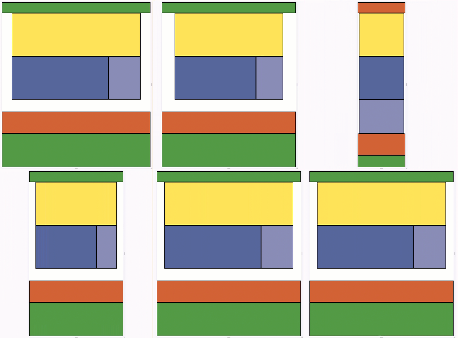
Other than an odd lack of content, we can see a fully-responsive website template in action here. A few things to note:
- The green section on the bottom stays on the bottom even if the main content (the purple/blue section) is less than the full height of the screen.
- The navbar changes from green to red/orange when the screen size has been reduced below a certain width threshold, defined by Boostrap.
- The purple/light blue section representing the sidebar collapses underneath the main content such that the sidebar is shown after the
article
Adding Essential Functionality
We will now start adding in some elements essential to many websites regardless of specialization. That’s to say — whether one is designing with eCommerce, SaaS, Blogging, or even Web Application development in mind some common elements will be useful. Among these, we will prioritize the following:
- Menus, Logos, and Buttons in the navigation menus
- A separate menu for mobile devices
- Footer menus
- A sticky sidebar
Many of these elements will be implemented in a way that leaves much room for customization. In other cases, we will make fairly biased design choices. In either case, I will attempt to explain design decisions meaningfully. First up, let’s add the logo, menu, and action item to the main navigation bar.
Each element added to the navigation bar will be “wrapped” with a Bootstrap-derived class. These classes confer certain CSS-driven behaviors to ensure proper display across devices. Below are our additions to the header:
<!-- Desktop/Laptop Menu -->
<nav id="mainNav" class="container-fluid navbar">
    <div class="container nav-wrapper">
        <div class="row nav-items">

            <!-- logo -->
            <div class="col-3 item">
                <div class="logo">
                    <a href="/">
                        <img src="logo.png" alt="alphaweb"/>
                    </a>
                </div>
            </div>

            <!-- menu -->
            <div class="col-6 item">
                <ul class=" nav-menu">
                    <li><a href="#">About</a></li>
                    <li><a href="#">Blog</a></li>
                    <li><a href="#">Contact</a></li>
                </ul>
            </div>

            <!-- Action Button -->
            <div class="col-3 item last">
                <button class="btn">Sign Up</button>
            </div>

        </div>
    </div>
</nav>
These additions illustrate what will be a common approach while using Boostrap: the use of container, row and col-* class elements. We’ll not dive deeply into their functionality but it’s important to understand the general hierarchy of use:
.
└── container/
    └── row/
        └── col-*
For deeper theory check out the official Bootstrap 5 grid documentation. In addition to these classes, there are many other “utility” classes that leverage the power of flexbox to reduce CSS styling burden. Moving on, our next step is to add some styles to the navbar to make it a bit more aesthetic. The following are additions:
/** style elements of the nav bar **/
.nav-menu {
    display: flex;
    list-style: none;
    justify-content: space-evenly;
    margin: 0;
    padding-left: 0;
    width: 100%;
}
.logo{
    width: 100%;
}
.nav-items{
    align-items: center;
}
.nav-items .item{
    display: flex;
    justify-content: flex-start;
}
.nav-items .item.last{
    justify-content: flex-end;
}

/** remove link styling on page **/
body a{
    text-decoration: none;
    color: unset;
}
body a:visited{
    color: unset;
}

/** style the action button **/
.btn{
    background: #000;
    padding: 1rem 2rem;
    color: #fff;
    border: none;
}

body{
    font-family: monospace;
}
These styles accomplish several things:
- Ensures the menu is evenly spaced and horizontal
- Adds a custom style to the button
- Ensures the logo is displayed properly
- Removes default styling to links on the page
- Adds
monospaceas the page font for some retro styling
The following figure shows an image of the navbar additions before and after the latest CSS styling classes were added:
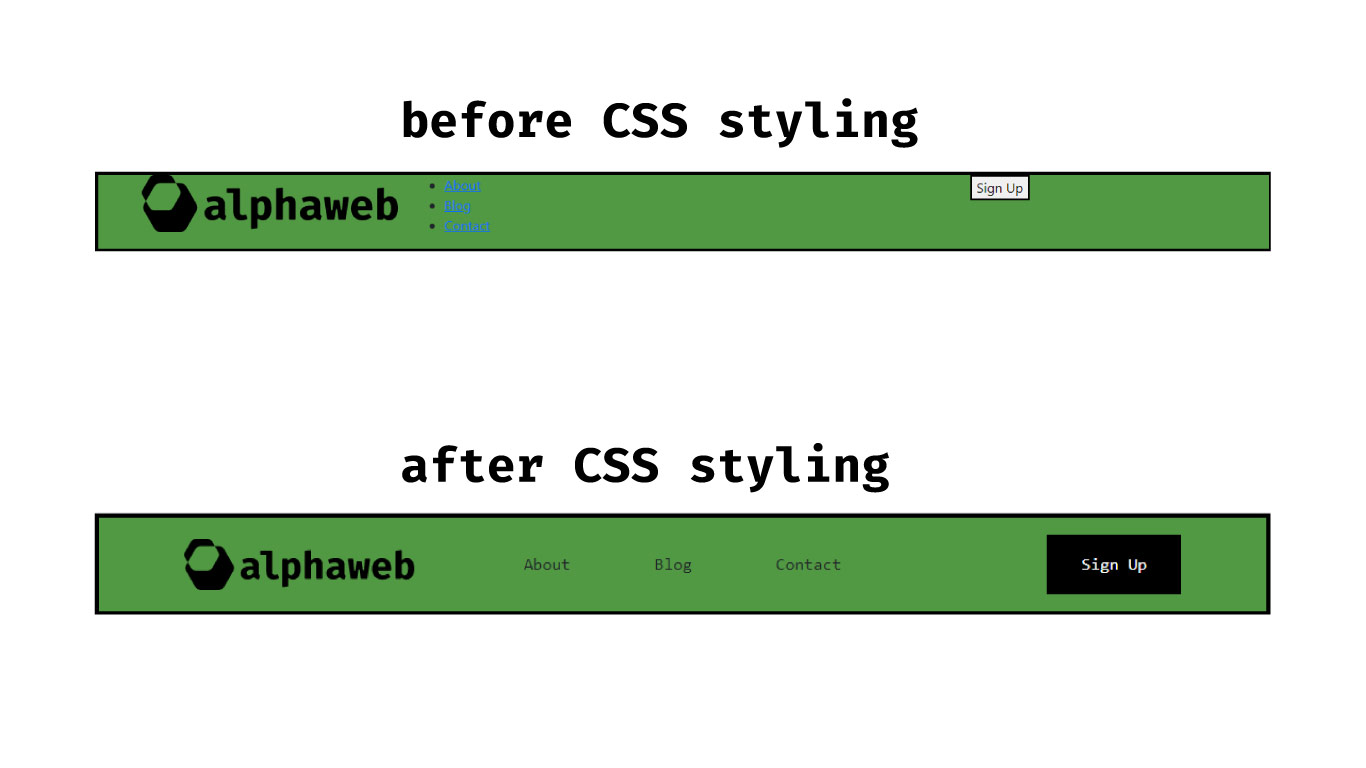
There are plenty of approaches to designing a responsive navbar in Boostrap. In fact, Boostrap has several navbar-specific classes in which developers can rely on battle-tested and purpose-designed CSS classes. Check out the Bootstrap Navbar Documentation for full details. Our approach here is with customization in mind.
Notable, this nav bar (see on screens above 768px in width) makes use of a container, row and several col-* classes. These col-* classes ensure that the logo, menu, and action button all maintain separation. The .nav-menu CSS class ensures our menu displays horizontally, has evenly spaced elements, and is centered vertically. All these are made possible with flexbox-specific CSS properties.
NOTE: Boostrap offers CSS utility classes such as d-flex, justify-content-evenly and others to avoid the need for additional CSS styling to enact basic flexbox specifications on elements. More on that here.
Mobile menus are a bit more complex than traditional desktop menus. When this template’s menu collapses down to mobile views there will not be room for the menu items, and likely the button, to display without either A.) overlapping, or B.) shrinking beyond recognition. As such, we will design a minimalist representation of our desktop menu for mobile with the following parts:
- A navbar with only the logo and an icon for a menu
- A full-screen mobile menu that only appears/disappears when the menu icon is clicked.
We will approach the first part of this much in the same way we approached the desktop header. The added code is as follows:
<!-- Mobile/Tablet Menu -->
<nav id="mobileNav" class="container-fluid navbar">
    <div class="container nav-wrapper">
        <div class="row nav-items">

            <!-- logo -->
            <div class="col-8 item">
                <div class="logo">
                    <a href="/">
                        <img src="mobile-logo.png" alt='alphaweb'/>
                    </a>
                </div>
            </div>

            <!-- Menu Icon -->
            <div class="col-4 item last">
                <div id="mobileMenuIcon">
                    <img src="menu.png" alt="menu"/>
                </div>
            </div>
        </div>
    </div>
</nav>
Here we see the now familiar container, row, col-* approach of hierarchical organization. In this case, we’re using col-6 to split horizontal spacing equally between the logo and menuIcon. We’ll add a width: 32px value to our #mobileMenuIcon element as well via our CSS styles. Below is the result so far:
This looks decent but we have a problem: nothing happens if the mobile menu icon is clicked. To remedy this situation, we need to add a full-screen menu and configure some basic JavaScript to control its visibility. First, we’ll add the HTML code (just below the closing </nav> tag for the mobile navbar:
...
  <!-- mobile menu overlay -->
  <div class="mobile-nav-menu">
    <ul class="nav-menu vertical">
      <li><a href="#">About</a></li>
      <li><a href="#">Blog</a></li>
      <li><a href="#">Contact</a></li>
    </ul>
  </div>

</nav>
This element can pretty much go anywhere — it’s included within the mobile nav element for sake of organization. We’ll add the following CSS styles as well:
.mobile-nav-menu {
    height: calc(100vh - var(--alpha-header));
    display: flex;
    flex-direction: column;
    justify-content: center;
    position: absolute;
    top: var(--alpha-header);
    background: #000000;
    color: #ffffff;
    width: 100%;
    touch-action: none;
    font-size: 2rem;
    text-align: center;
}
.mobile-nav-menu ul{
    flex-direction: column;
}
.mobile-nav-menu li {
    padding: 2rem;
}
Generally speaking, this creates a full-screen overlay in which menu items are displayed in a vertical manner. The text size is increased, the content is centered, and touch-action: none ensures that the page doesn’t scroll while a user interacts with the menu. Below is how the mobile menu now appears:
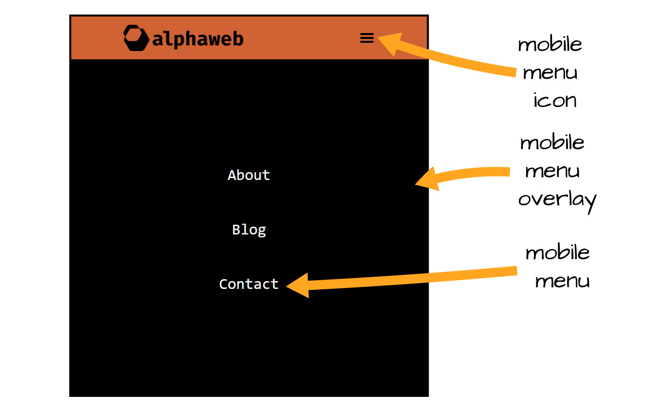
This provides the functionality such that the navbar doesn’t have to be relied upon to display the menu items. On mobile screens, where horizontal space is precious, this ensures there are as few constraints as possible with respect to what can be shown on the menu. Navigation items are essential, after all.
We are now faced with a problem — the mobile menu displays as intended but is always shown. It is shown when the page loads and it continues to be shown even if the menu icon is clicked. We will add some very basic JavaScript to support the following functionality for the menu:
- Hidden by default;
- Shown when the menu icon is clicked;
- Hidden again when the menu icon is clicked again;
- Can be shown/hidden as often as a user desires;
To accomplish this, we will add the following JavaScript code in a script element within the same parent container as our menu for the sake of organization:
<script>

    // select the menuIcon and assign to variable
    var mmIcon = document.getElementById('mobileMenuIcon');

    // select the mobile nav menu and assign to variable
    var mm = document.querySelector('.mobile-nav-menu');

    // add event listener to execute function when icon clicked
    mmIcon.onclick = function() {

        // add/remove the 'expanded' class from the menu on clicks
        mm.classList.toggle('expanded');
    };
</script>
Prior the development of the toggle method (bound to a DOMTokenList object) one would need to get a list of all classes assigned to an HTML element, check if the class being toggled was assigned, then handle based on that result. The toggle method does all that for us and adds/removes a expanded class every time the mobile menu icon is clicked. We will use this class to control the visibility of the mobile nav menu. Additionally, we’ll hide the mobile menu initially as well. The updated CSS is as follows:
/** add to existing class **/
.mobile-nav-menu{

    /** new values **/
    visibility: hidden;
    opacity: 0;
}

/** create new class **/
.mobile-nav-menu.expanded{
    visibility: visible;
    opacity: 0.9;
}
Here we set the menu to hidden initially and visible when the expanded class is shown. The opacity settings can be used later to smooth out the appearance via transition values if desired. Here is the result of the new CSS and JavaScript to control the mobile menu:
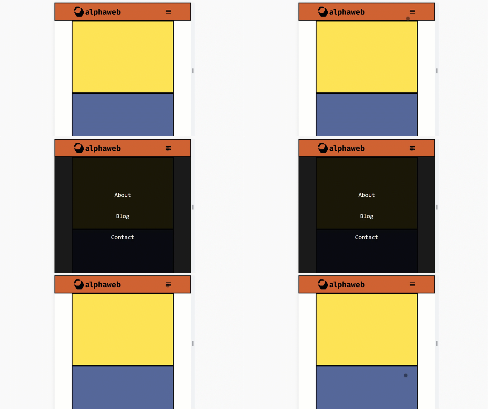
Here we see the desired functionality as the menu is hidden initially, shown after clicking the menu icon, then hidden again — ad nauseam. At this point our template is looking like an actual website. The last step will be to develop a footer menu area where menus with links can be added as well as essential links like privacy policy, terms and conditions, and any disclosures.
Footer menus are essential to a modern website. They display non-navigational links to essential resources. These might include links such as the following:
- Company mission statements
- Personal website bio pages
- Customer service links (e.g. help, submit a ticket, etc.)
- Account pages on eCommerce sites
- Social media links
- Affiliate, medical, or financial disclosures
There is no limit to what can go in a footer. Generally, the number of menus, the complexity of design, and aesthetics are dictated to some degree by the amount of information needed. For example, Amazon.com’s footer section is much more complex than that of a personal blog. For the alphaweb template, we’ll use the container, row, col-* approach we’ve used in other sections to add the following:
- Brand Impressum
- Menu Sections
- Sub-footer menus for legal stuff and copyright information.
We’ll start by adding the Bootstrap structure with some contrived content:
<!-- footer menu area -->
<div id="footerPrimary" class="container">

<!-- New Content Starts Here -->
<div class="row">

  <div class="col-md-4 col-sm-12 footer-logo">
    <div class="logo">
      <a href="/">
        <img src="footer-logo.png" alt="alphaweb"/>
      </a>
    </div>
    <p class="impressum">
      A responsive webpage template based on Boostrap5 and common HTML5 elements.
    </p>
  </div>
  <div class="col-md-2 col-sm-6 footer-menu">
    <h4 class="menu-title">Company</h4>
    <ul class="menu">
      <li><a>About Us</a></li>
      <li><a>Our Team</a></li>
      <li><a>History</a></li>
      <li><a>Events</a></li>
      <li><a>Careers</a></li>
    </ul>
  </div>
  <div class="col-md-2 col-sm-6 footer-menu">
    <h4 class="menu-title">Accounts</h4>
    <ul class="menu">
      <li><a>Orders</a></li>
      <li><a>Refunds</a></li>
      <li><a>Reward Points</a></li>
      <li><a>Watchlist</a></li>
      <li><a>Help</a></li>
    </ul>
  </div>
  <div class="col-md-2 col-sm-6 footer-menu">
    <h4 class="menu-title">Connect</h4>
    <ul class="menu">
      <li><a>Newsletter</a></li>
      <li><a>Blog</a></li>
      <li><a>Calendar</a></li>
      <li><a>Media</a></li>
      <li><a>Brand</a></li>
    </ul>
  </div>
  <div class="col-md-2 col-sm-6 footer-menu">
    <h4 class="menu-title">Follow Us</h4>
    <ul class="menu">
      <li><a>Twitter</a></li>
      <li><a>Github</a></li>
      <li><a>LinkedIn</a></li>
      <li><a>YouTube</a></li>
      <li><a>Instagram</a></li>
    </ul>
  </div>
</div>
Next up we’ll add the sub-footer area. This will be a two-column section at the very bottom. The code for this section, directly following the code above, is as follows:
<!-- subfooter menu area -->
<div id="subFooter" class="container">
    <div class="row nav-items">
      <div class="col-md-6 item">
        © alphaweb. All rights reserved.
      </div>
      <div class="col-md-6 item last">
        <ul class="menu">
          <li class="menu-item"><a>Privacy Policy</a></li>
          <li class="menu-item"><a>Terms & Conditions</a></li>
          <li class="menu-item"><a>Disclosures</a></li>
        </ul>
      </div>
    </div>
</div>

<!-- End footer Section & Wrapper -->
</footer>
</div>
This produces a layout that is in the right direction, has some decent mobile responsiveness, but still needs a little CSS work. Here’s our initial result:
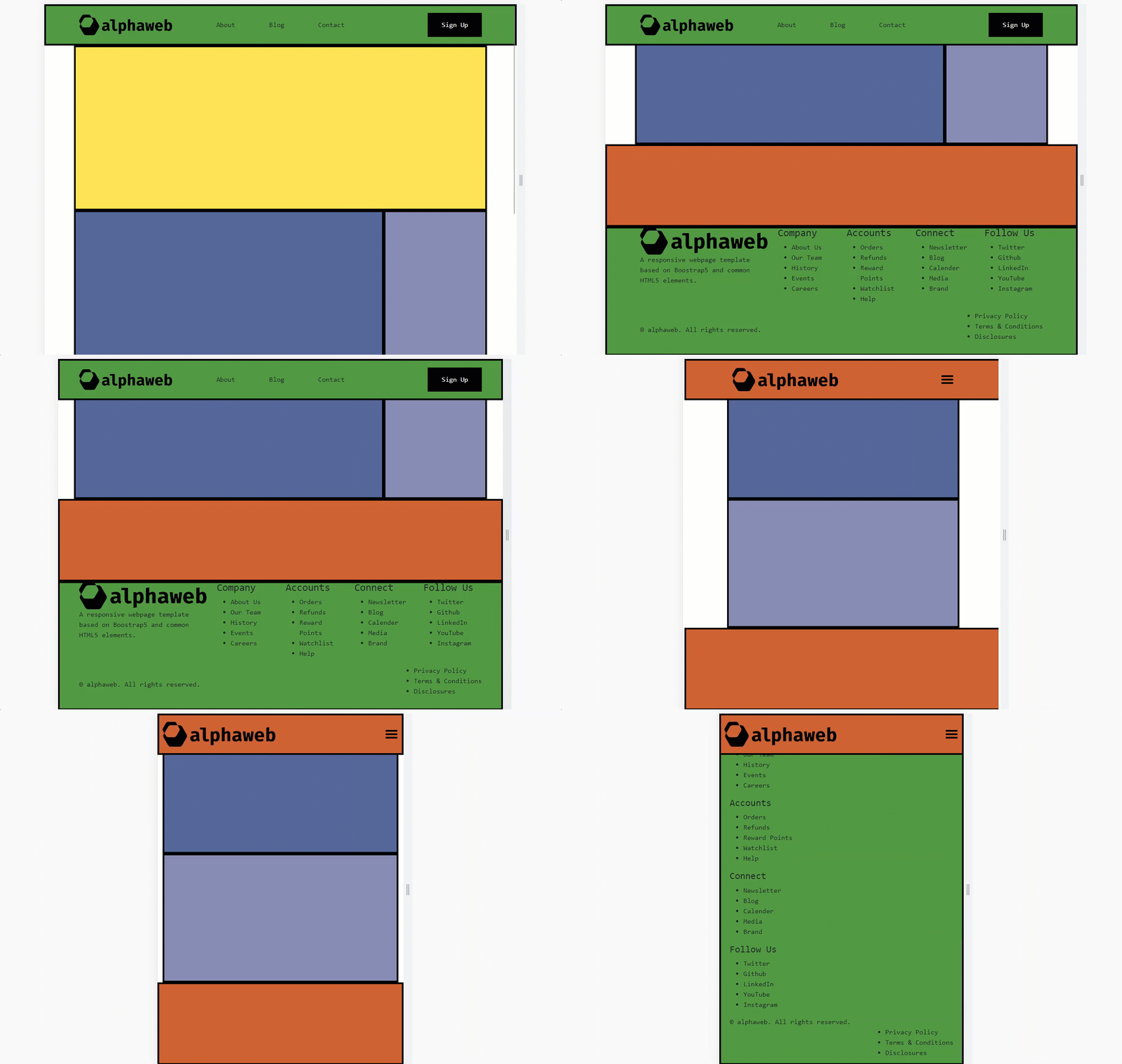
All the required elements are here but we need some additional CSS to ensure things display properly. Below is some additional CSS specific to the footer and a few extra tweaks to iron out some bugs:
/** Footer adn subfooter menu display **/
.menu{
    display: flex;
    flex-direction: column;
    list-style: none;
    padding-left: 0;
    margin: 0;
}
#subFooter .menu{
    flex-direction: row;
}

/** some padding for footer elements **/
footer{
    padding: 2rem 0 1rem 0;
}
footer .menu-item{
    padding: 0 1rem;
}
#subFooter{
    font-size: .8rem;
    padding: .5rem 0;
}


/** tweaks to menu items **/
@media screen and (max-width: 768px) {
    .nav-items .item.last, .nav-items .item{
        justify-content: center ;
    }
    .footer-menu{
        text-align: center;
    }
}
#mobileNav .item.last{
    justify-content: flex-end;
}
With these styles, our layout now demonstrates the following behavior:
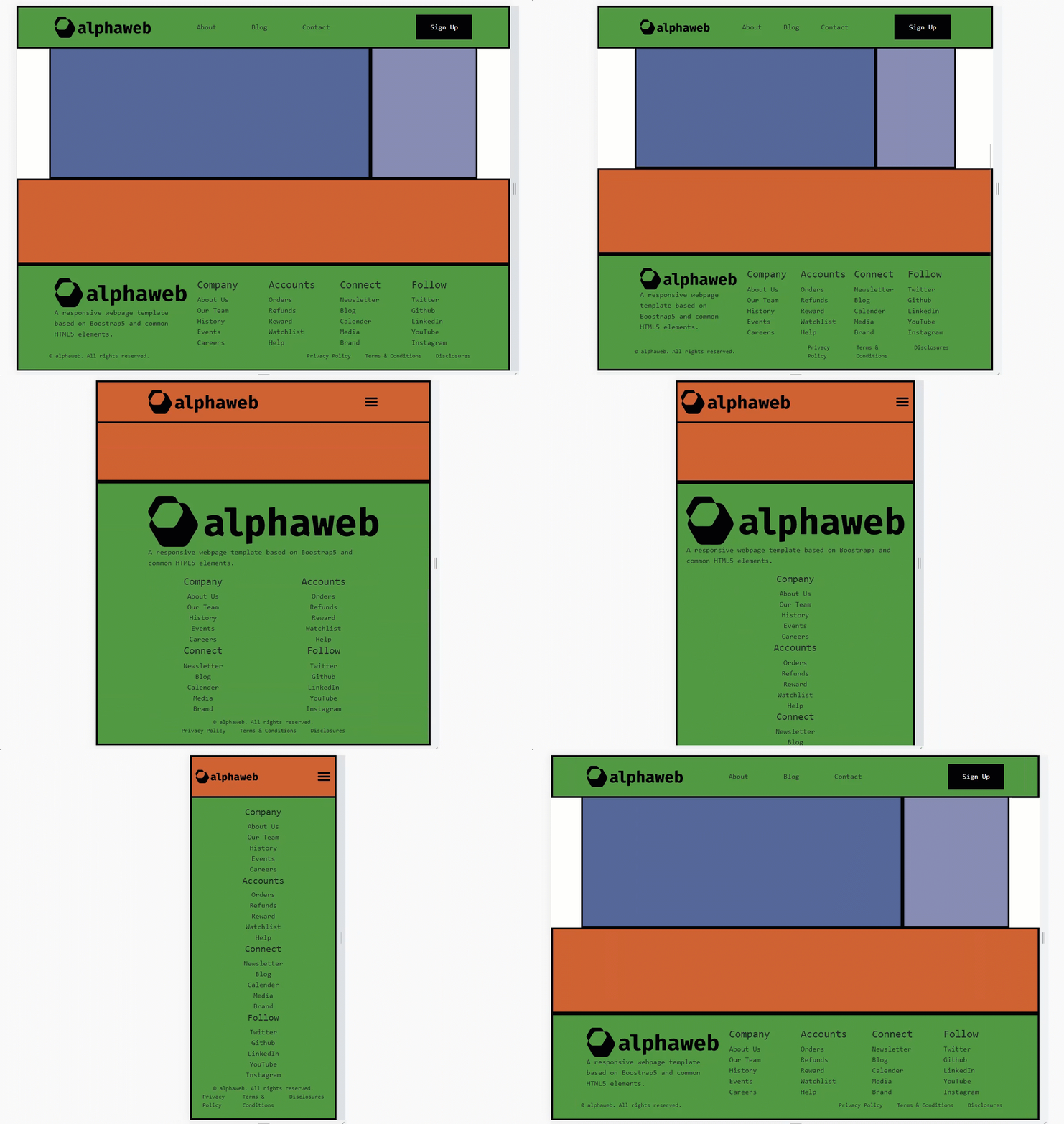
the alphaweb responsive bootstrap template now reflects a layout common to many websites. This footer can be adapted to show fewer col-* elements, add/remove any specific entries, or be reduced entirely. The beauty of Bootstrap is that the container, row, and col-* elements are very re-mixable.
Code Repository & Demo
The code for this tutorial is available on Github as a periodically updated repository. The code may, or may not, reflect what we’ve seen here. A working demo of the alphaweb template is available here.
Closing Remarks
This tutorial has covered a lot of ground. We have created navigation menus, mobile overlays, responsive content sections, sticky sidebars, and even a subfooter menu. This layout is common among content-presenting websites such as news sites and blogs but can easily be used for eCommerce as well. Using the header and footer sections only is also a possibility — such that one would replace the content section with a custom-designed layout.
References
- The State of CSS. “2021 State of CSS Survey.” State of CSS. 2021. Available Here: https://2021.stateofcss.com/en-US/technologies/css-frameworks
Accessed: June, 2022. - Otto, Mark. “Bootstrap from Twitter.” Twitter, Inc. 2011. Available Here: https://blog.twitter.com/developer/en_us/a/2011/bootstrap-twitter. Accessed: June, 2022.


